Insurance products
Branding Illustration
2020

Wolff Olins approached me to integrate illustration as part of the branding for one of the leaders in insurance products in the US. They offer auto, home, life insurances plus investment and banking products.
Based on the brand guiding philosophy, the illustration approach is an optimistic view of society where human interaction is the main focus.
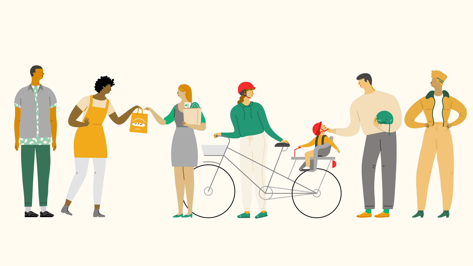
Illustration wants to tell stories and deliver a message of togetherness, focusing on small groups, relationships and intimate moments in people’s lives. We want to be warm and welcoming, but not cheesy or excessively sentimental.

Style
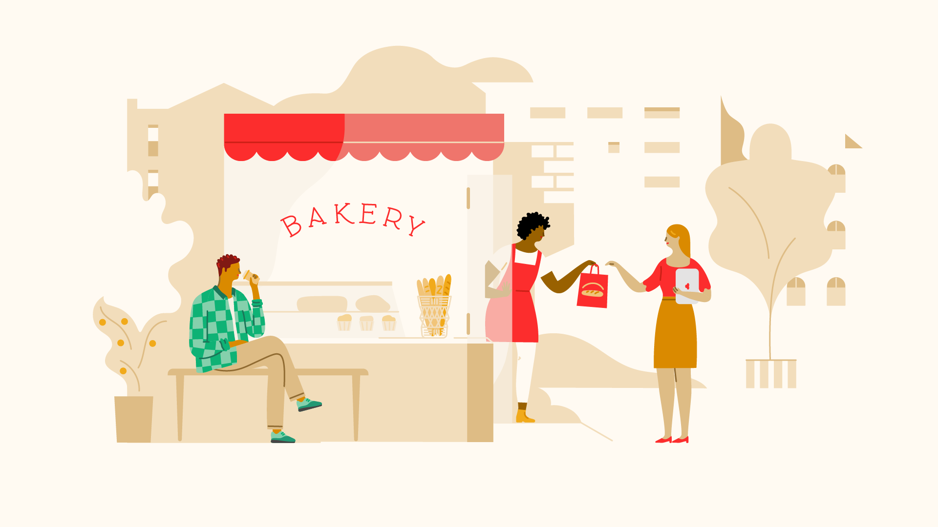
Organic, using curves and flowy drawings, we don’t use pointy edges and use more strict geometry just for objects and background elements.
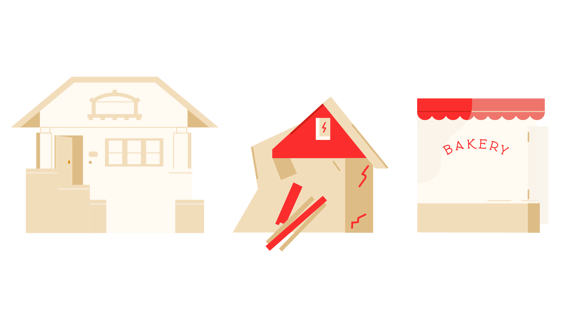
It uses colored shapes and supporting line, playing with positive / negative spaces.
Our color palette is very limited and the brand red takes us through the story and highlight the key elements.
The illustration is open and the elements play between background and foreground.
It uses colored shapes and supporting line, playing with positive / negative spaces.
Our color palette is very limited and the brand red takes us through the story and highlight the key elements.
The illustration is open and the elements play between background and foreground.
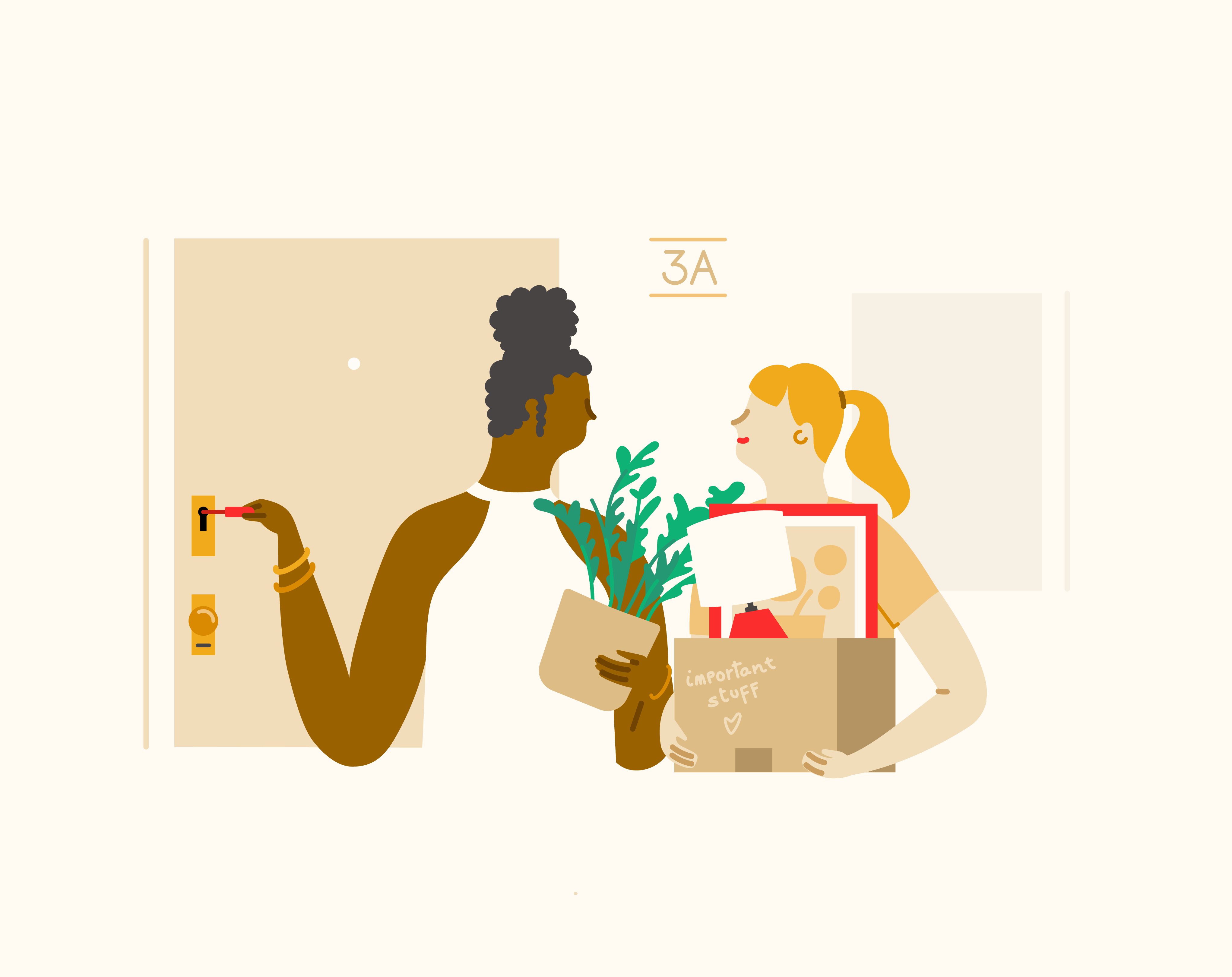
 Featuring car insurance, safety tips and small business insurance on the top hero.
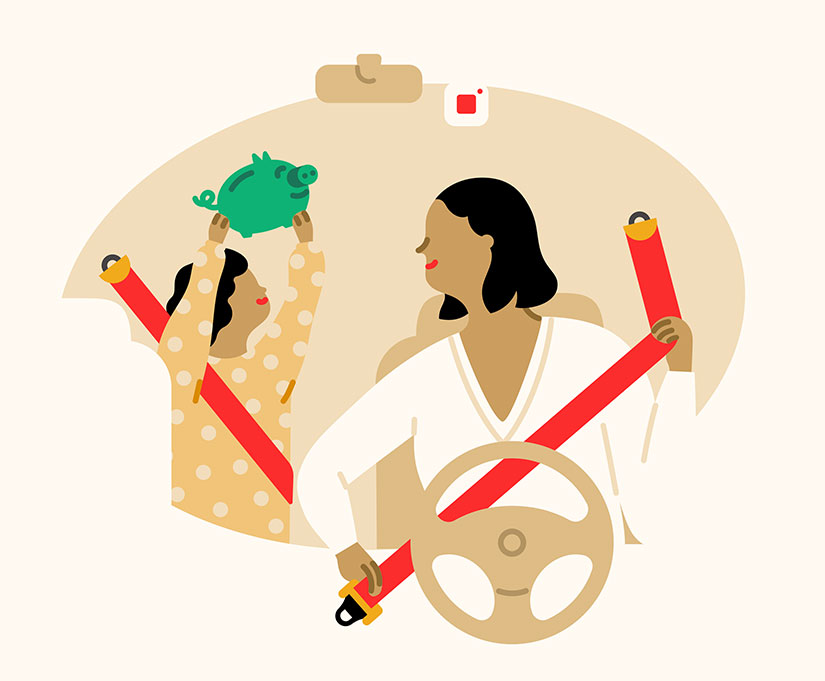
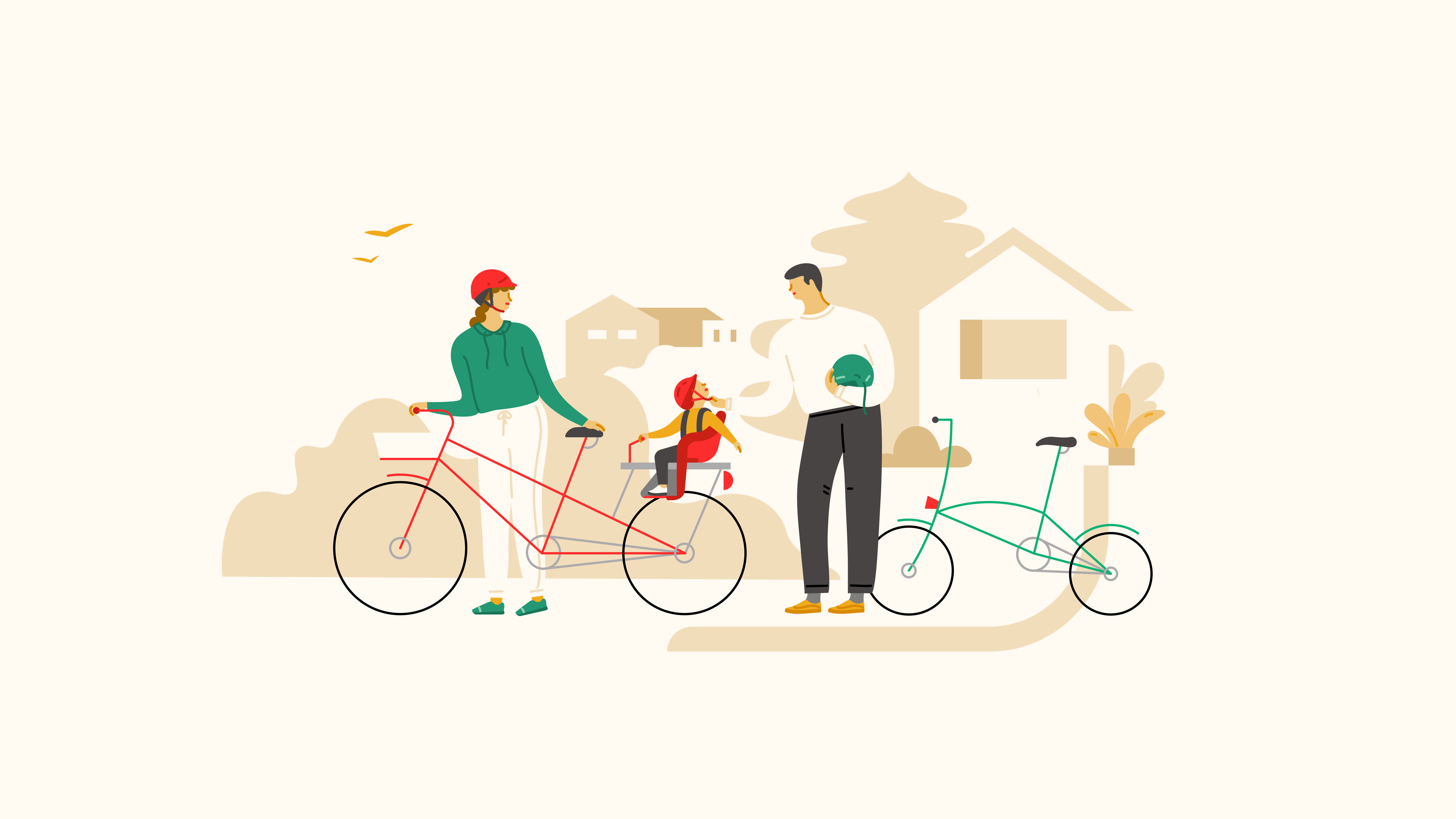

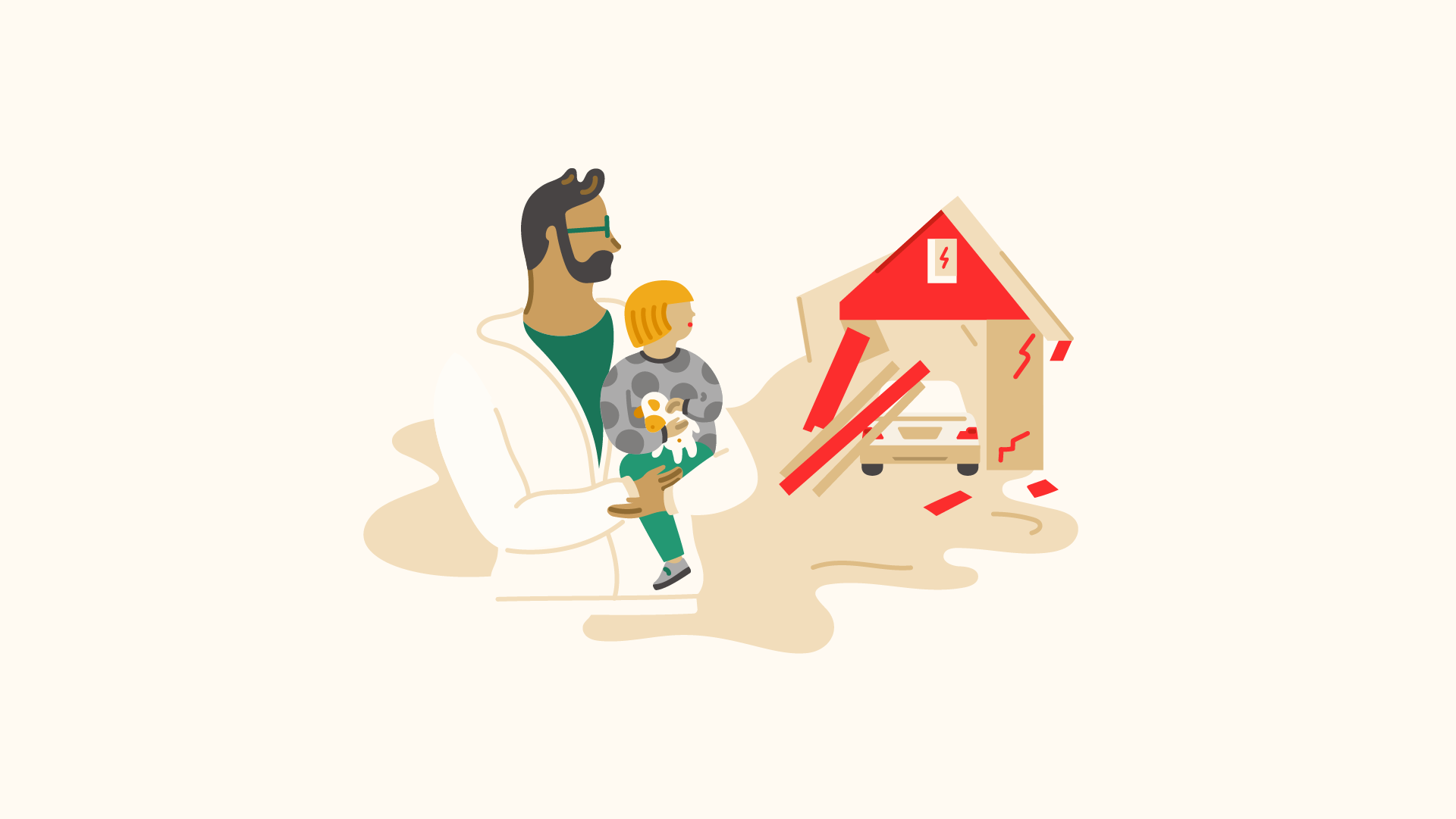
College savings, renters insurance, catastrophe claims, home and moving insurance.

Characters
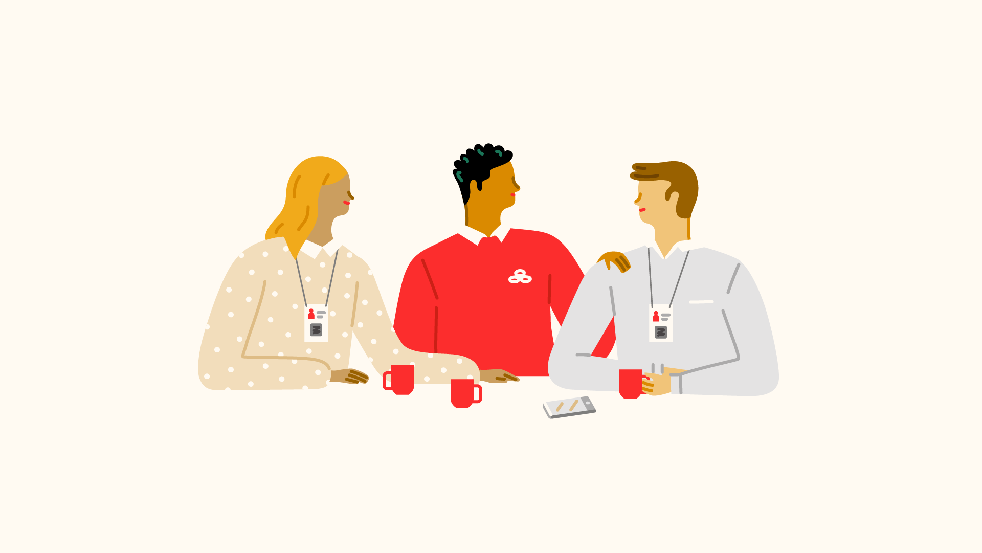
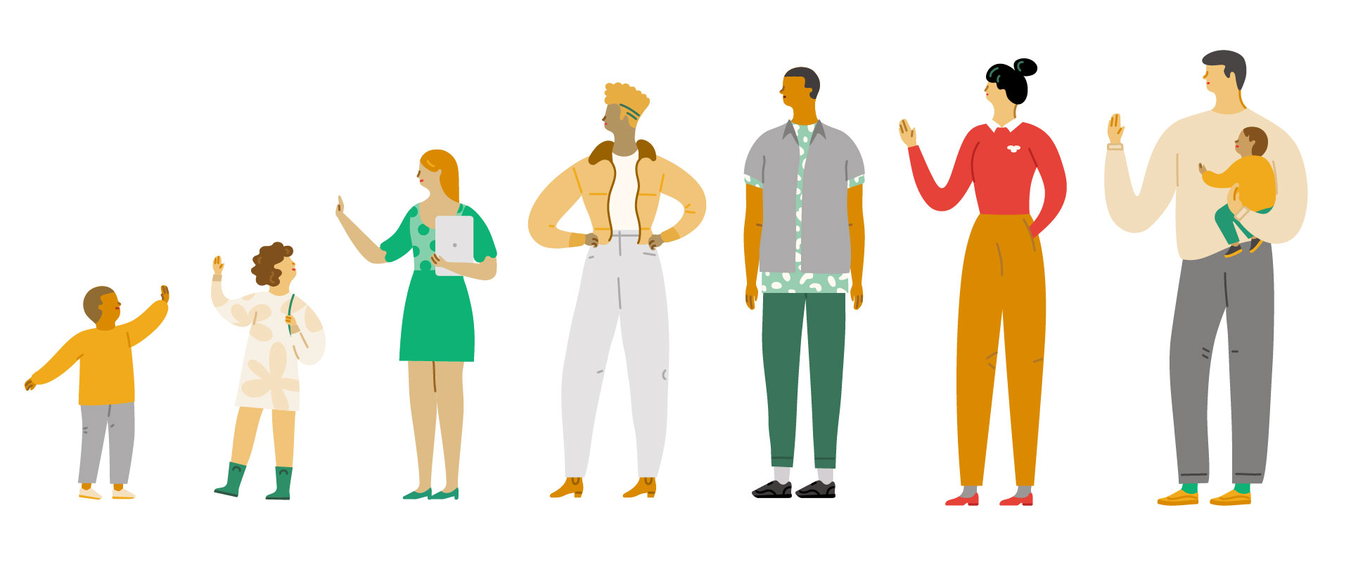
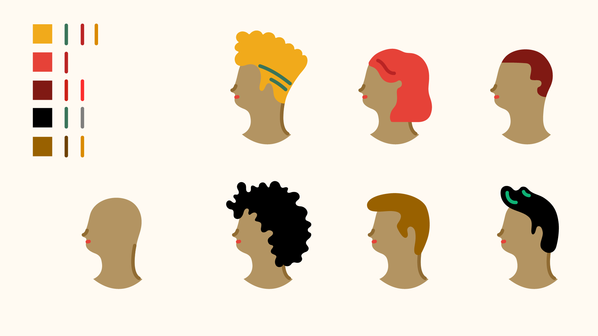
We choose to represent specific people in concrete circumstances.
A key part of the illustration is to introduce the agent as a main figure in the scenes and stories told. We want to reinforce the link between the brand and the people in the neighborhood.
A key part of the illustration is to introduce the agent as a main figure in the scenes and stories told. We want to reinforce the link between the brand and the people in the neighborhood.
Flexibility
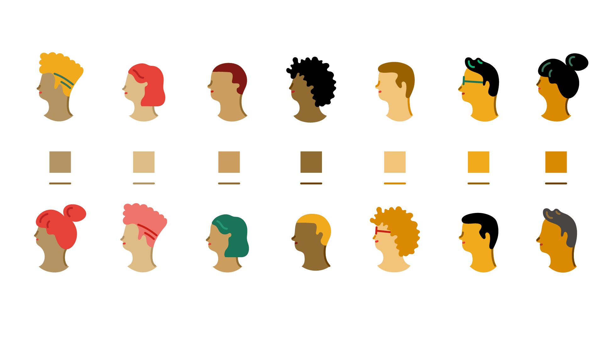
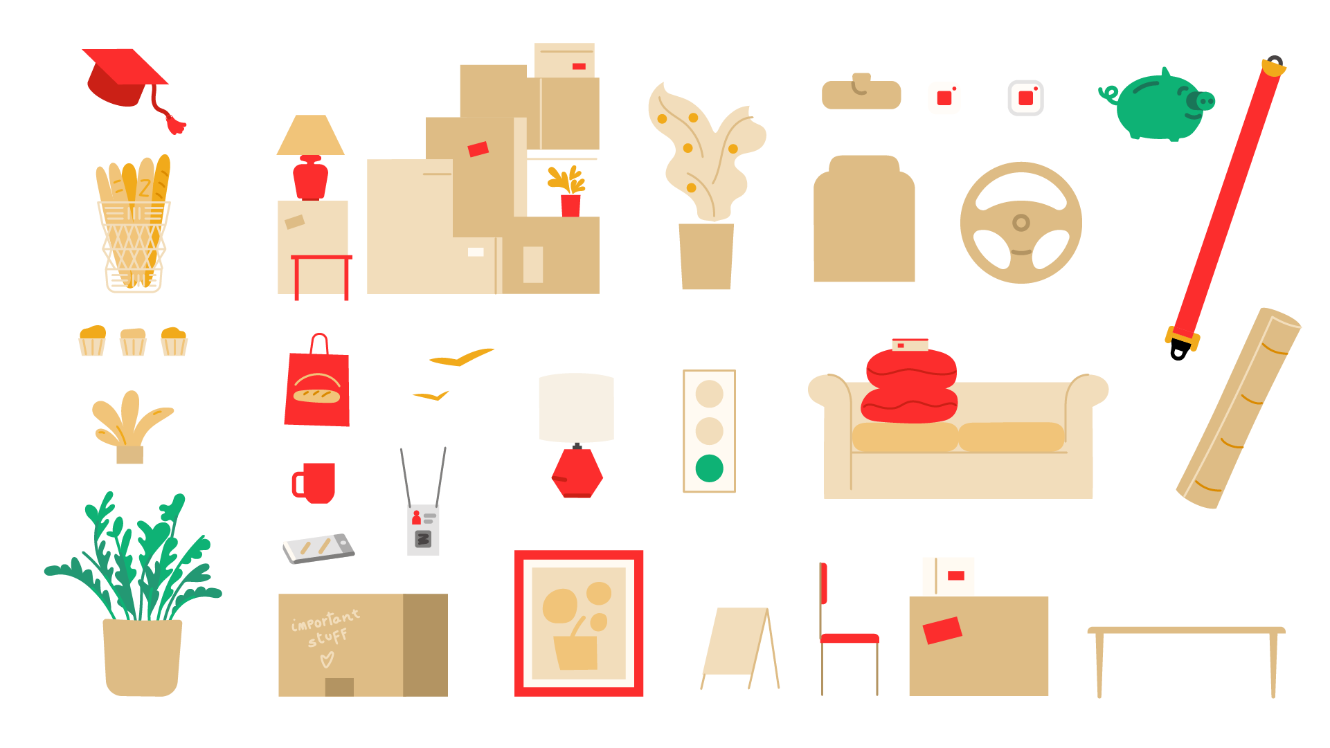
The goal of this illustration style is to establish a system where multiple assets can be combined in different ways depending on the communication needs, medium or canvas size.
To do that I built a vector library with not only final assets ready to use, but also raw files with many assets that can be organized by categories: characters, vehicles, pets, objects, background elements, etc.
To do that I built a vector library with not only final assets ready to use, but also raw files with many assets that can be organized by categories: characters, vehicles, pets, objects, background elements, etc.



Sketches
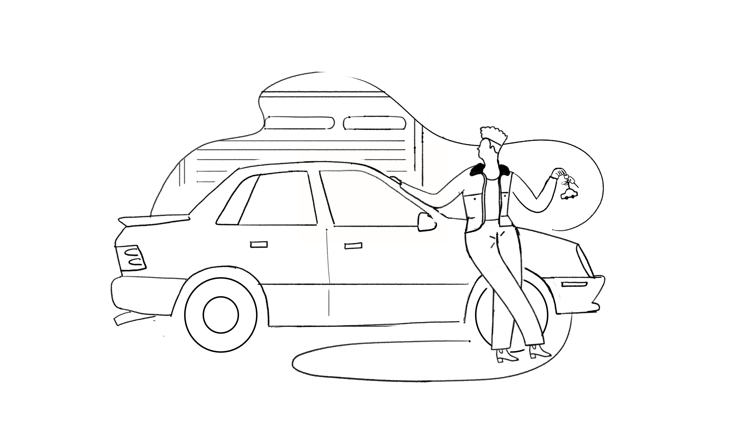
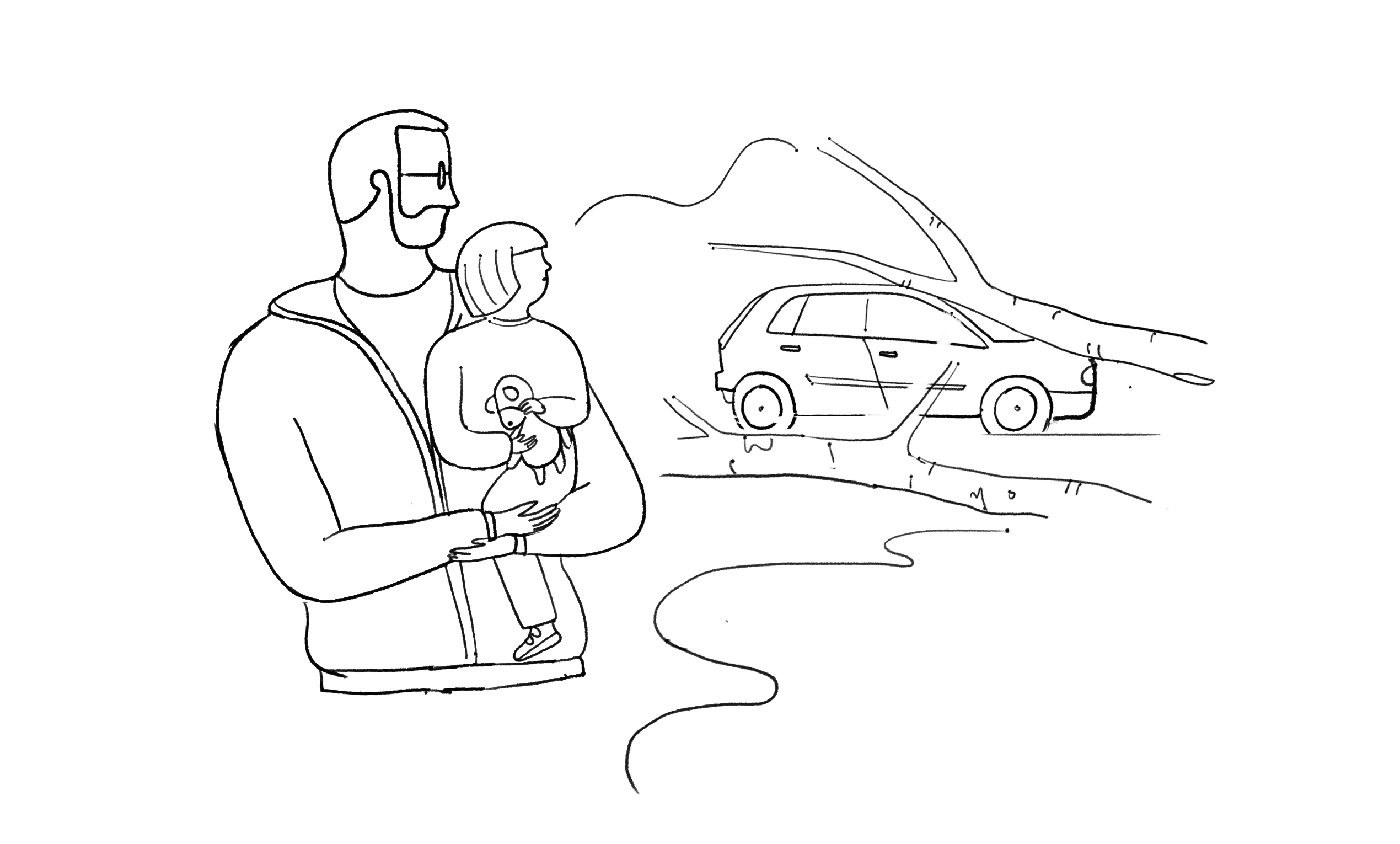
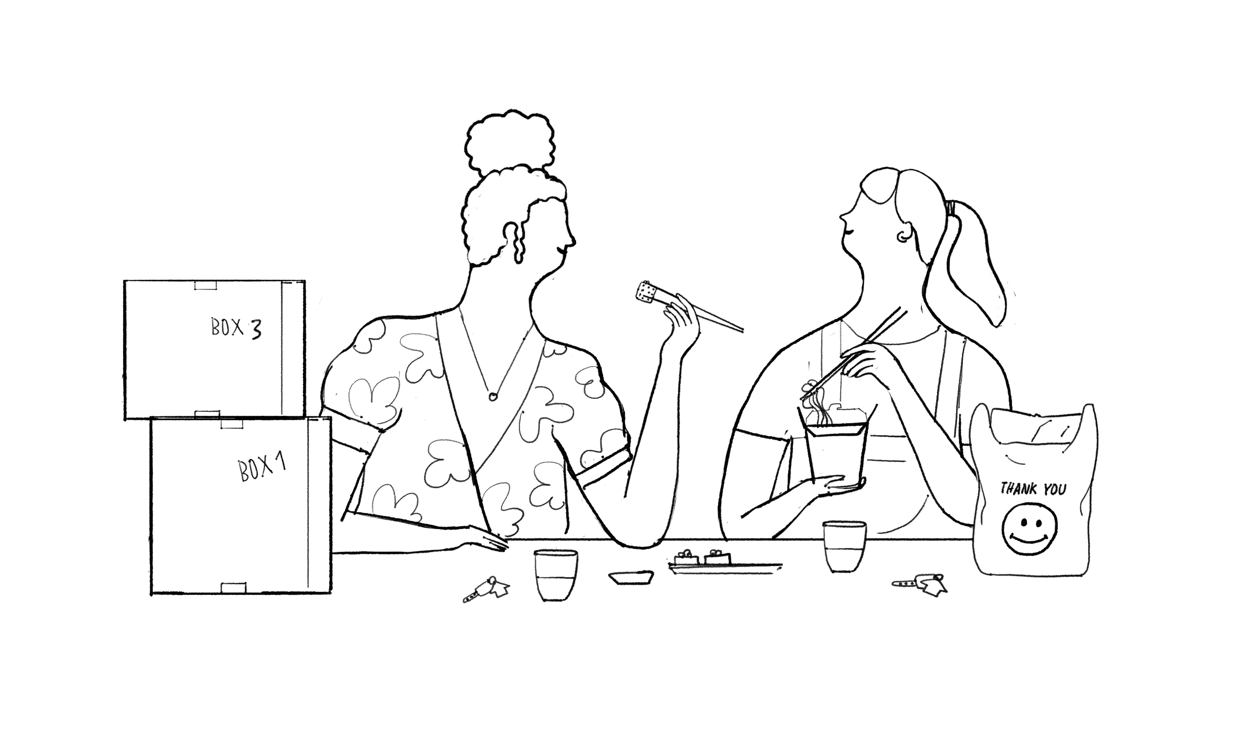
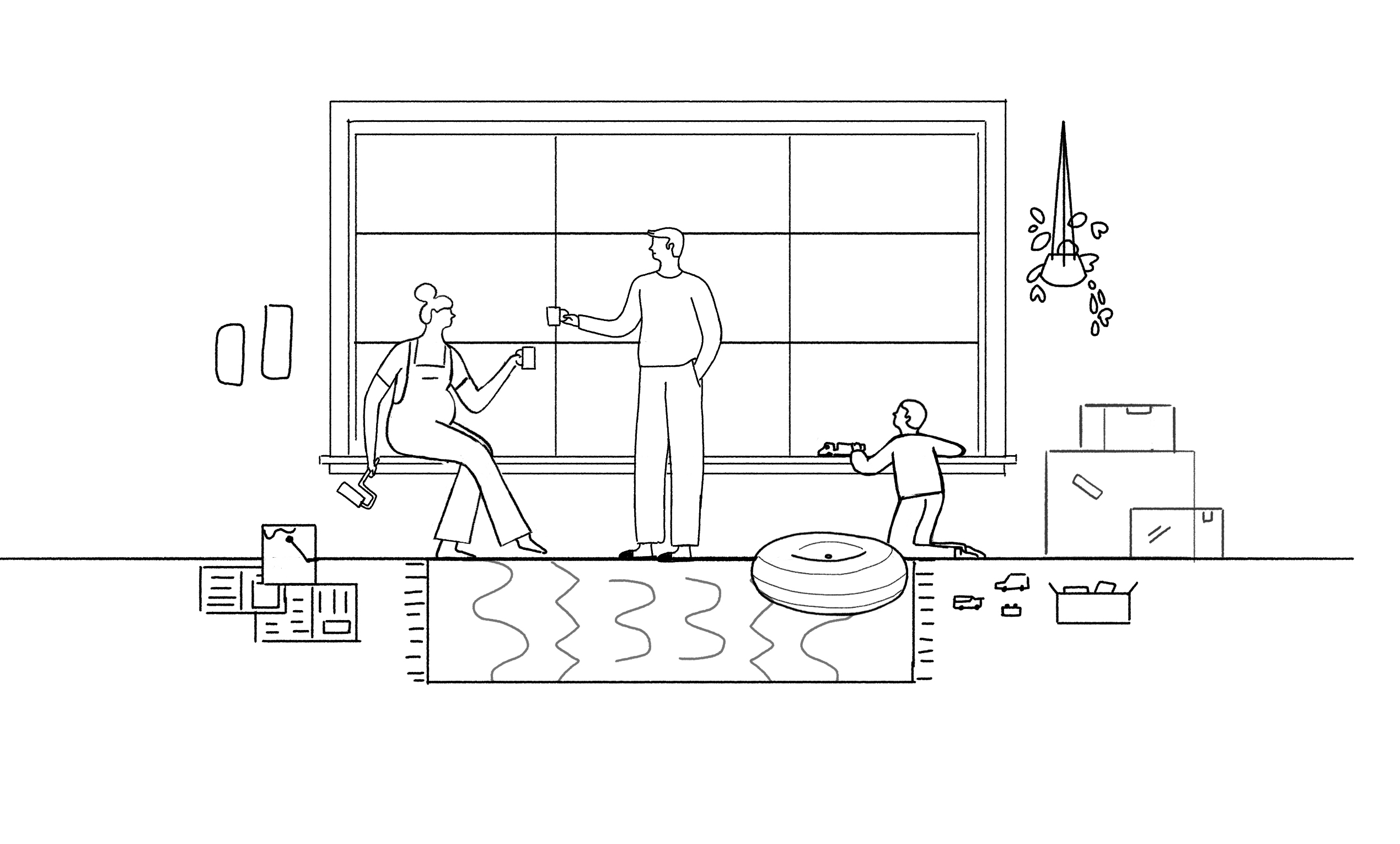
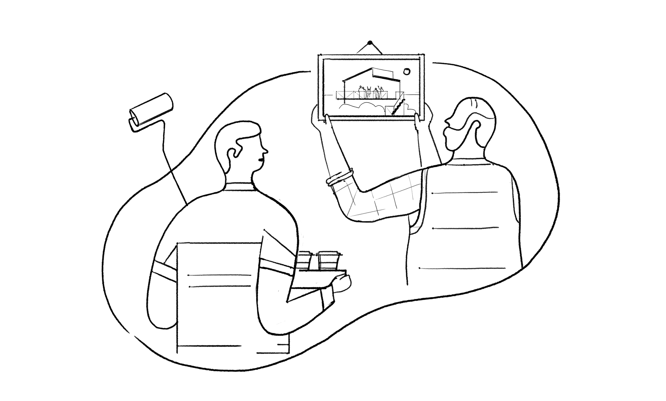
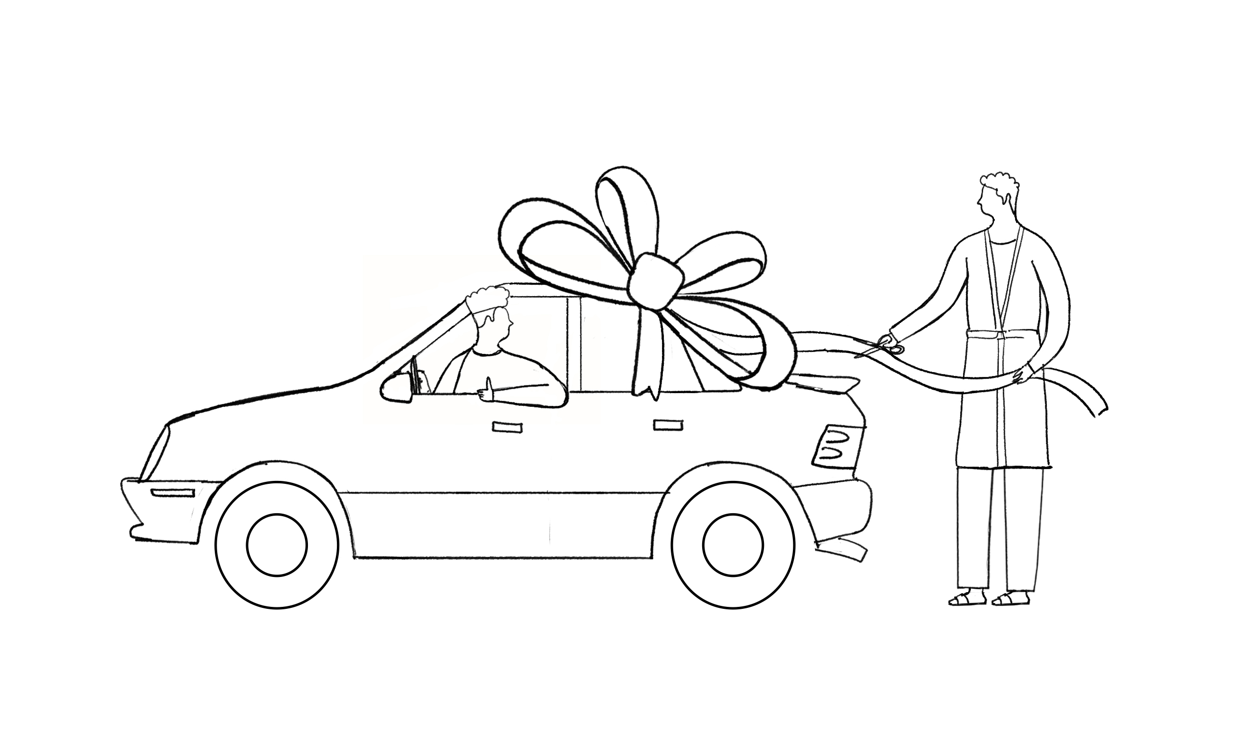
A very important part of branding illustration is the storytelling that goes behind every image. For each final illustration there are many moments crafted, personal stories and people profiles. My way to work all this out with the client is through pencil sketches where we try to brainstorm, understand and picture different scenarios, describe cities and places and try details. Just a few of these sketches end up being final illustrations.


Credits
Brand design team at Wolff Olins.
CD: Chris Kline - AD: Jaymes Moore - Producer: Matt Welch
All images © lauraalejo.com 2005-2023
Powered by PROMSITE BY CDMON
Powered by PROMSITE BY CDMON
