LloydsDirect
Pharmacy
Branding Illustration
2020
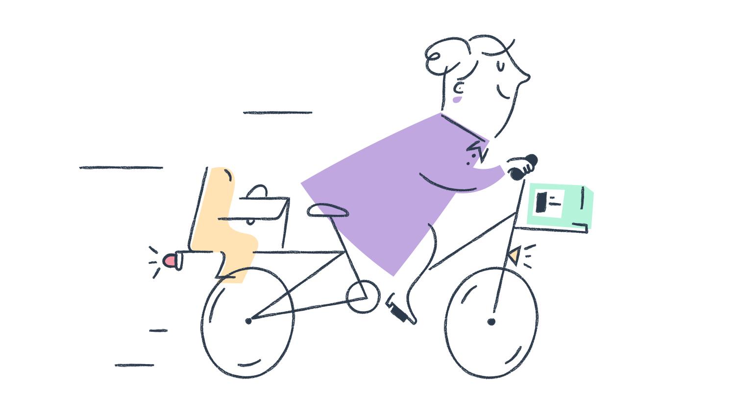
This project for LloydsDirect by Lloyds Pharmacy ( used to be Echo Pharmacy) is one of my favorites so far. Coming direct from the client I had the opportunity to work hand to hand with the creative team lead by Andy Ainger right when they were starting to redesign and rebrand the product and online presence.
It has resulted in a beautiful and cohesive brand exercise, really fun, optimistic and light.
A bright side on the health industry in our current times, Echo, whose mantra is “We believe in people not pills” and with a strong mission to deliver medicines easily and stress free has bet for a colorful, gentle and sincere approach to their branding.

Overview
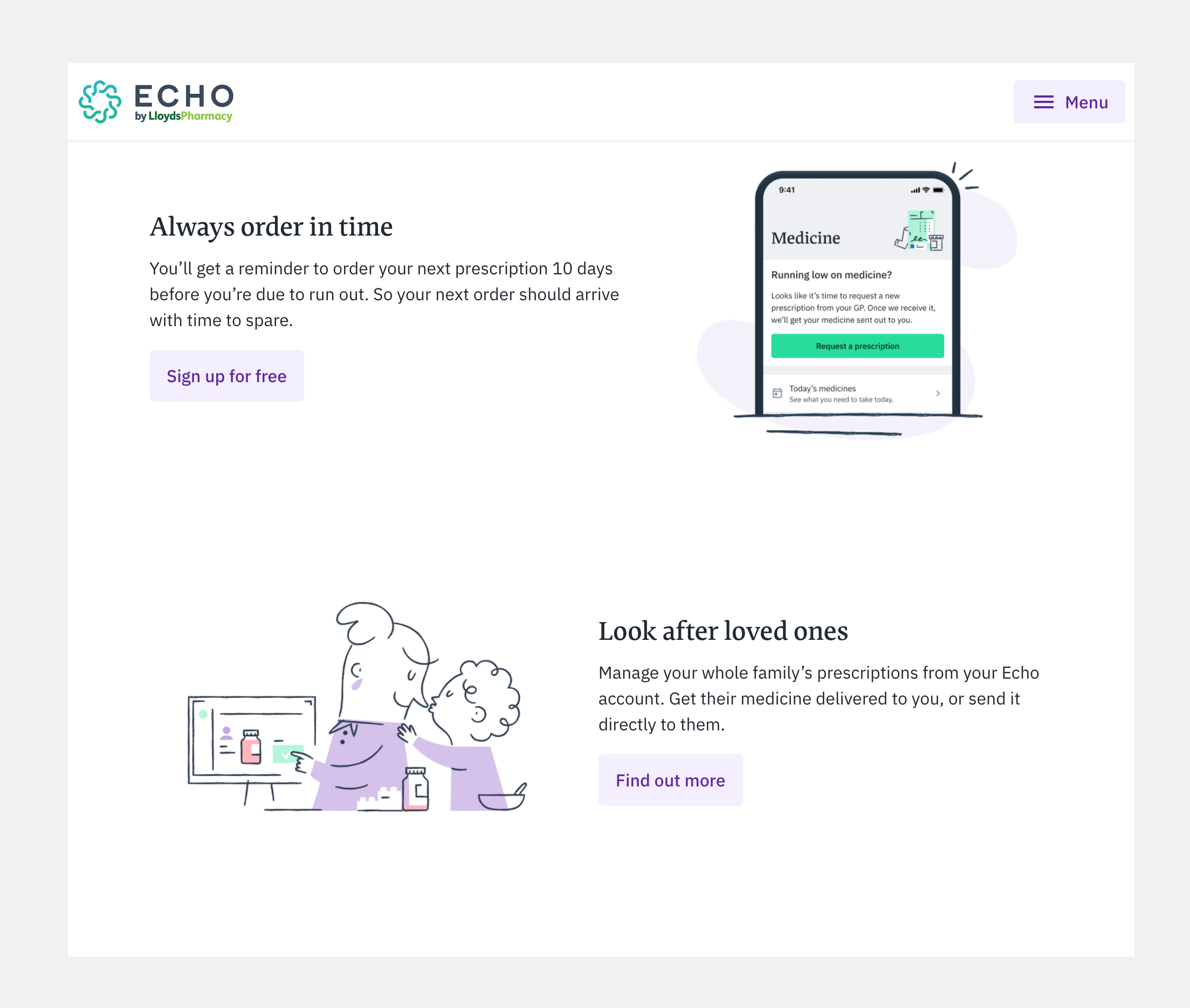
Illustration principles:
- To tell stories focused on people’s lives and how Echo helps them with something routine but extremely important as medication is.
- Focus the bright side of the story.
- People, medicine and data are equally important to show.

Categories
Small
(pictograms)
58x58 px
(pictograms)
58x58 px
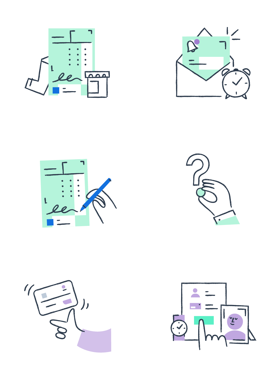
Medium
(native headers)
100x84px
(native headers)
100x84px
Medium-wide
(web headers)
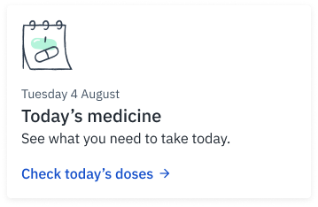
355x140px
(web headers)
355x140px
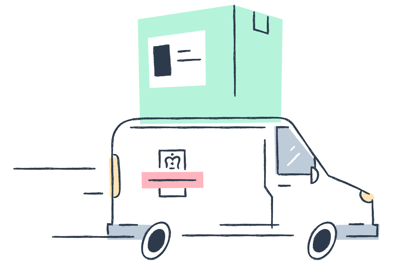
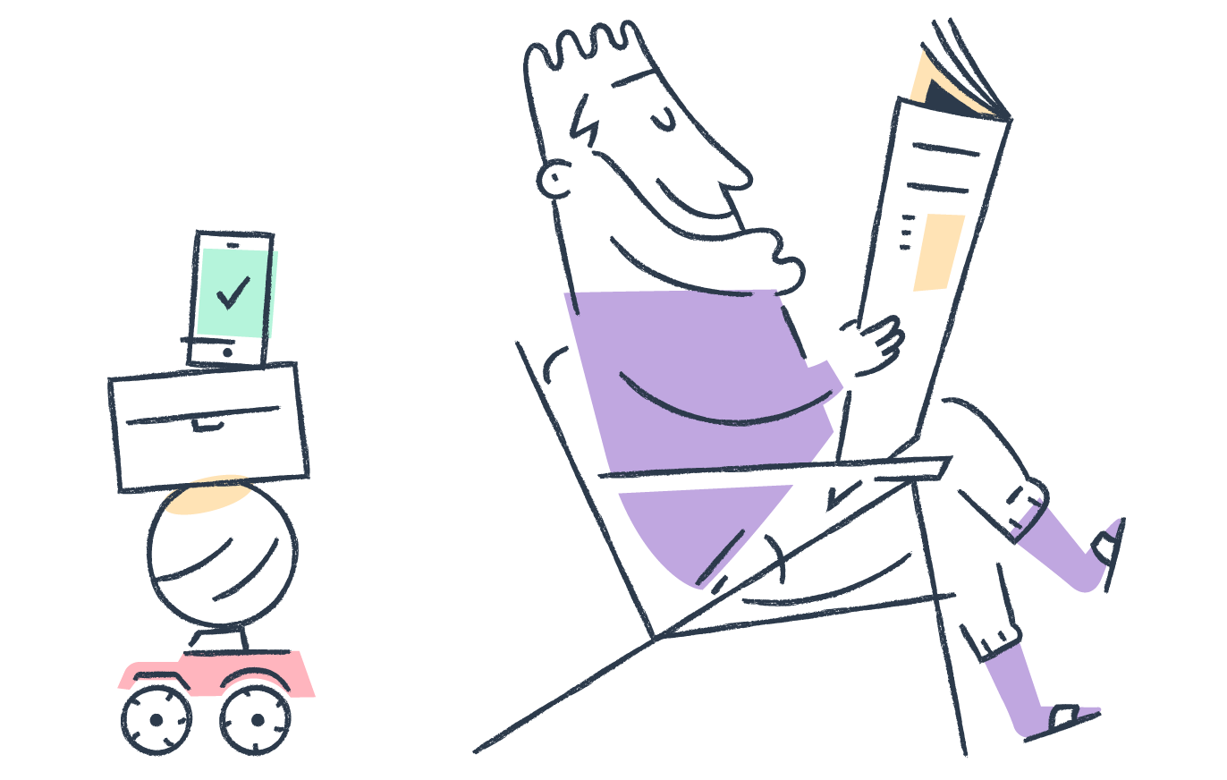
Large
(web headers / spots)
348x218px
(web headers / spots)
348x218px

Used to describe a key product feature in
a very minimal way.
a very minimal way.
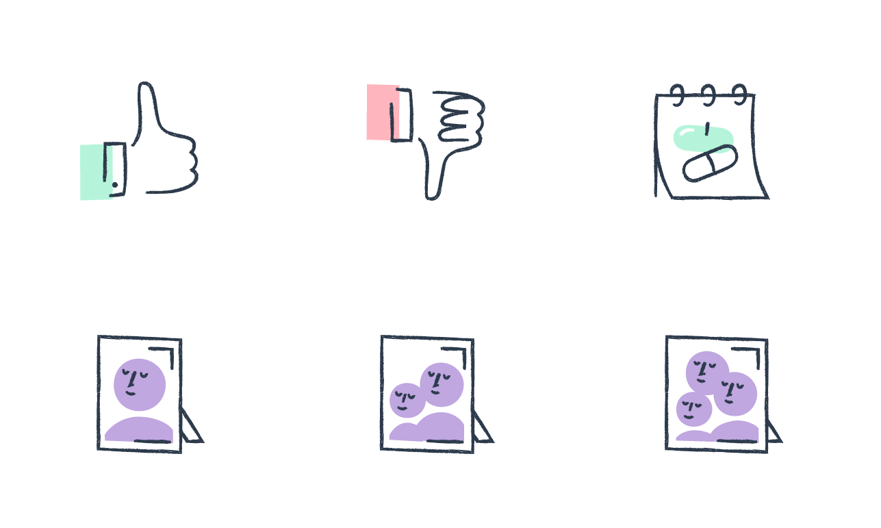
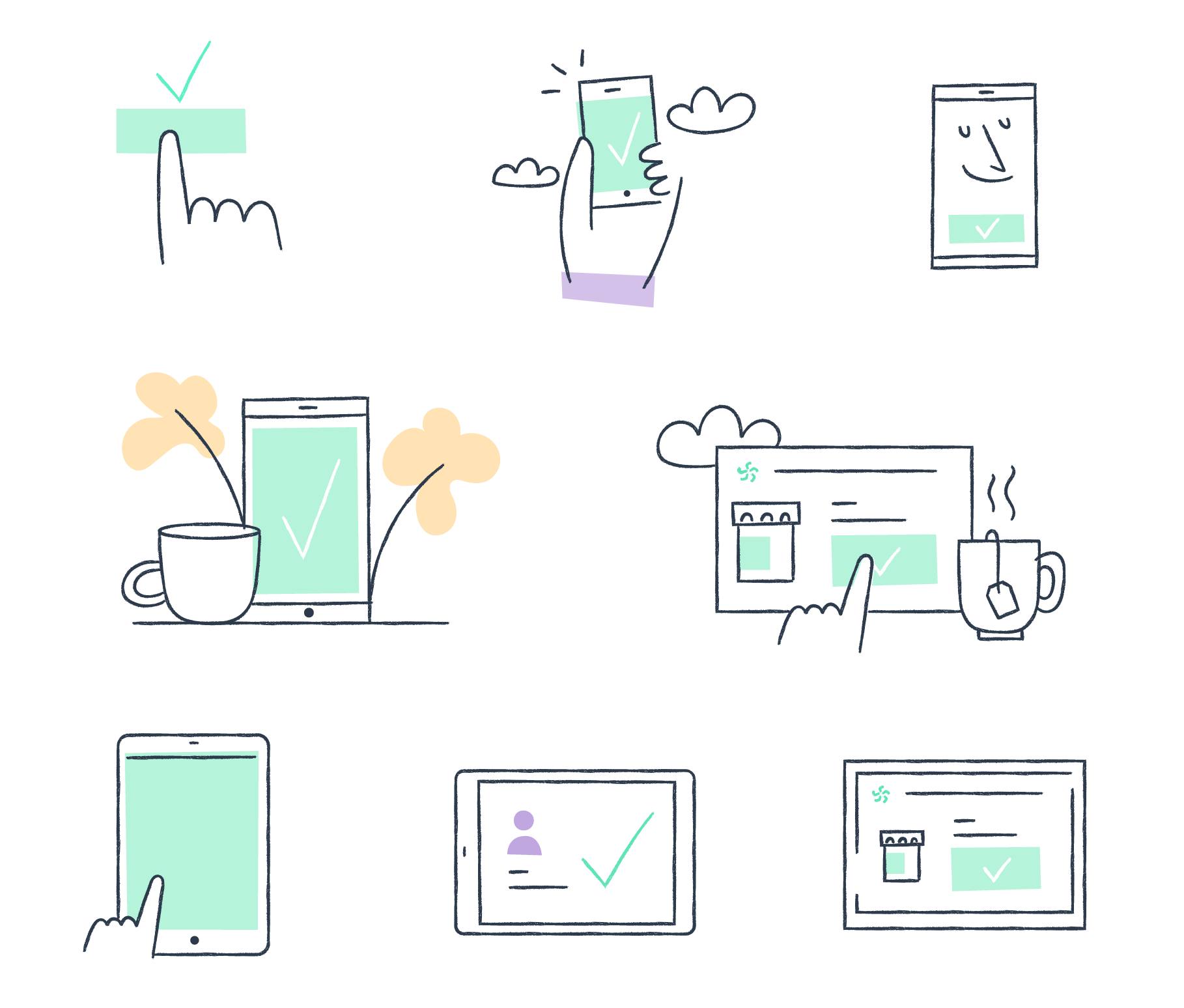
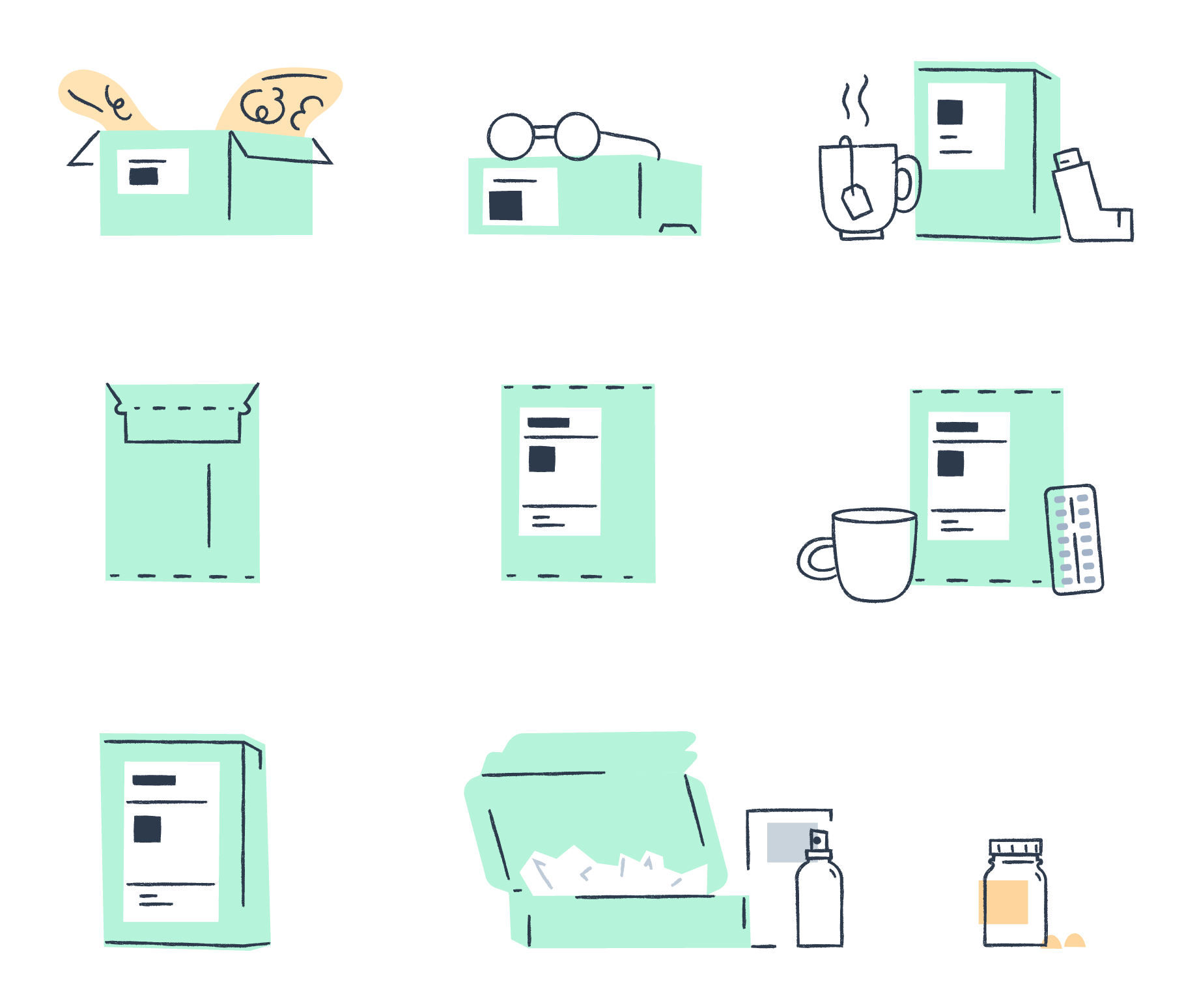
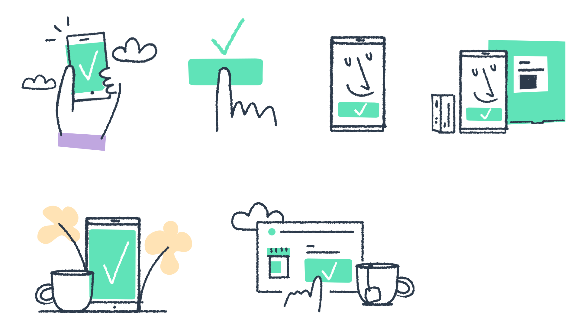
Simple composition of still life elements that illustrate a category with simplicity using the minimal amount of elements to explain a concept.
Extensions of the medium format, adding elements to fill up a horizontal space in web.
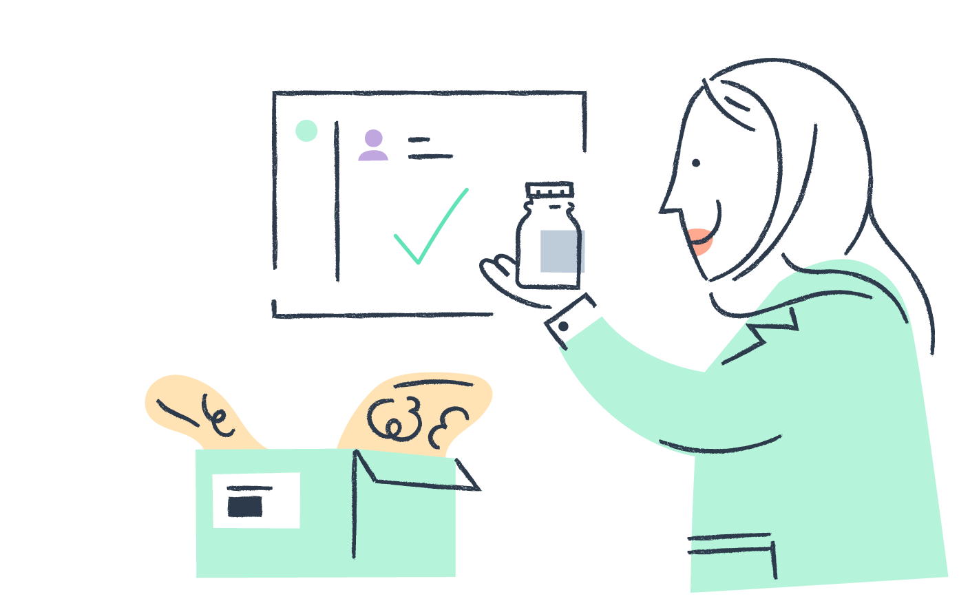
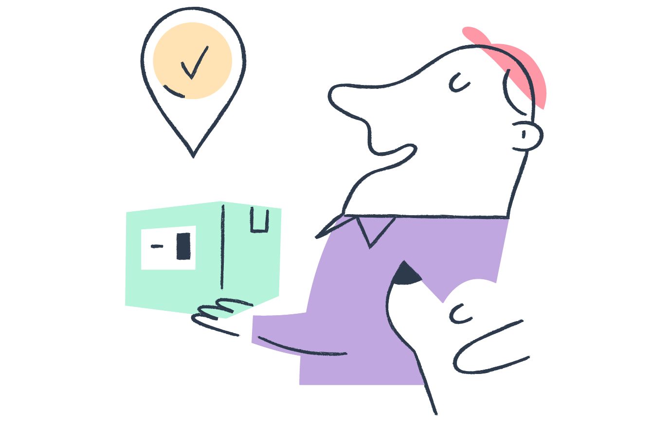
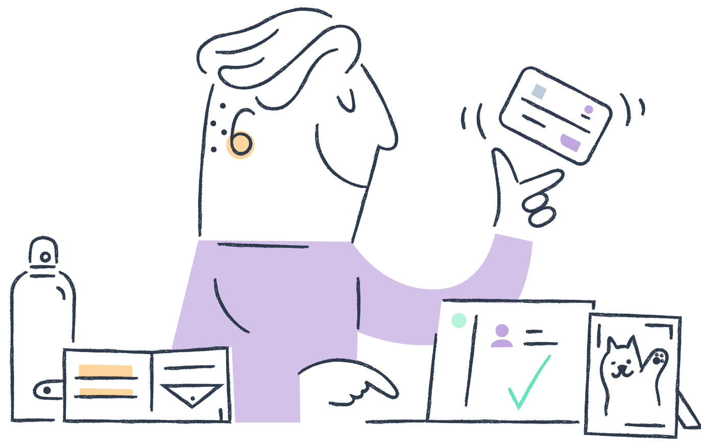
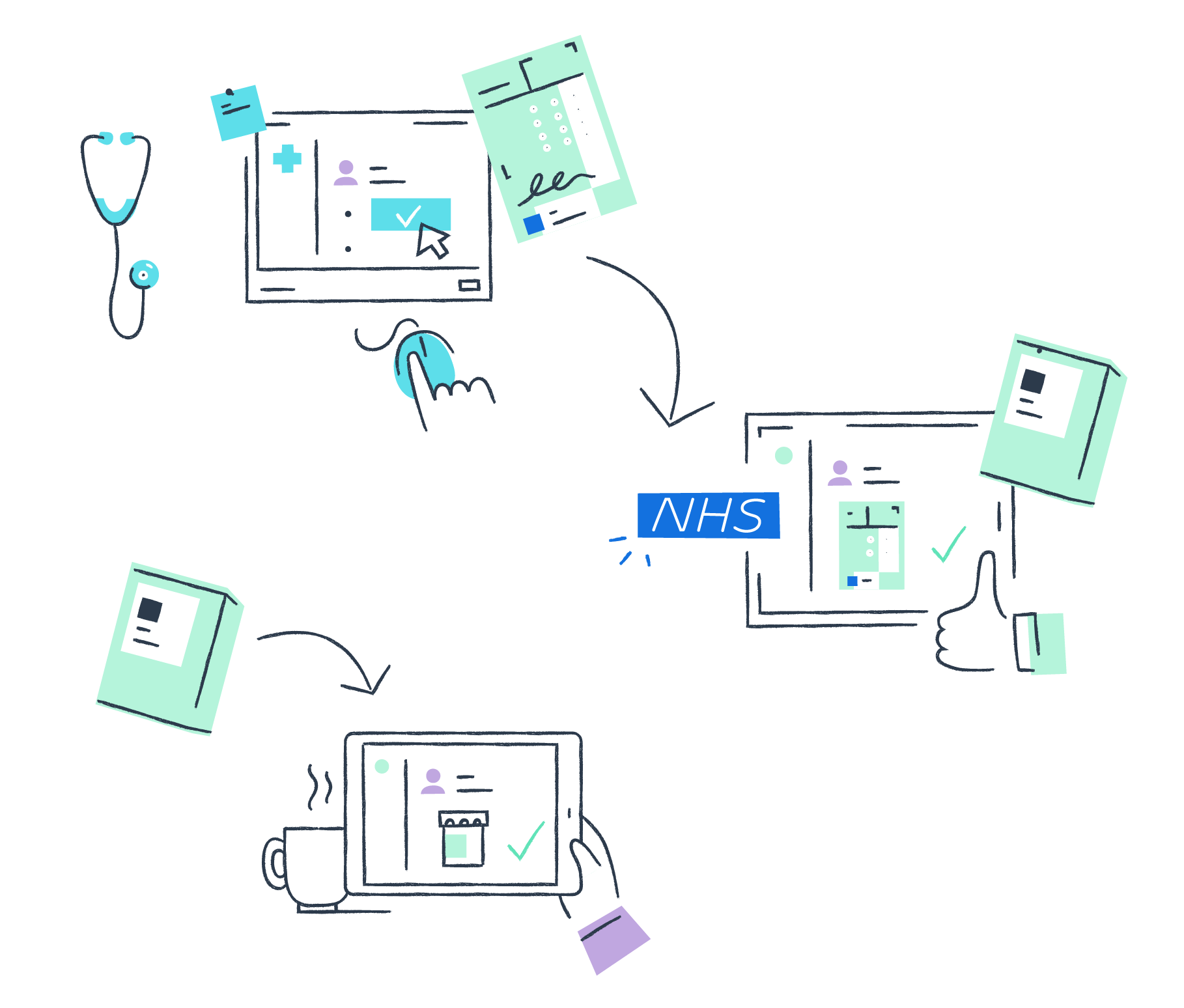
Detailed moments from the customers lives or specific actions by the Echo team.
The goal is to focus in certain product features and show human interaction.
The goal is to focus in certain product features and show human interaction.
Final assets
Medicine product icons
Small
Pictograms
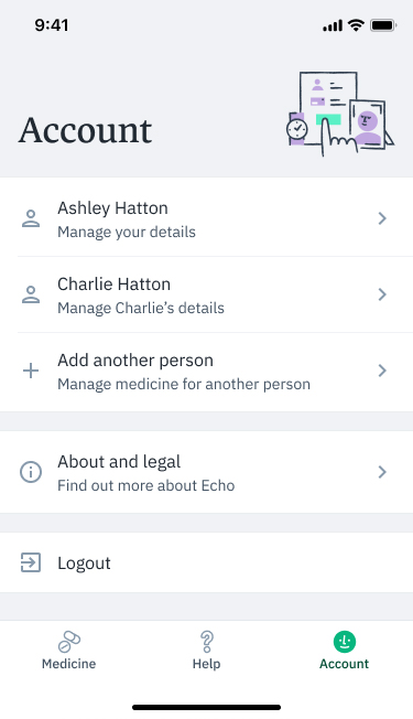
Medium
Native Headers
Medium wide
Web Headers


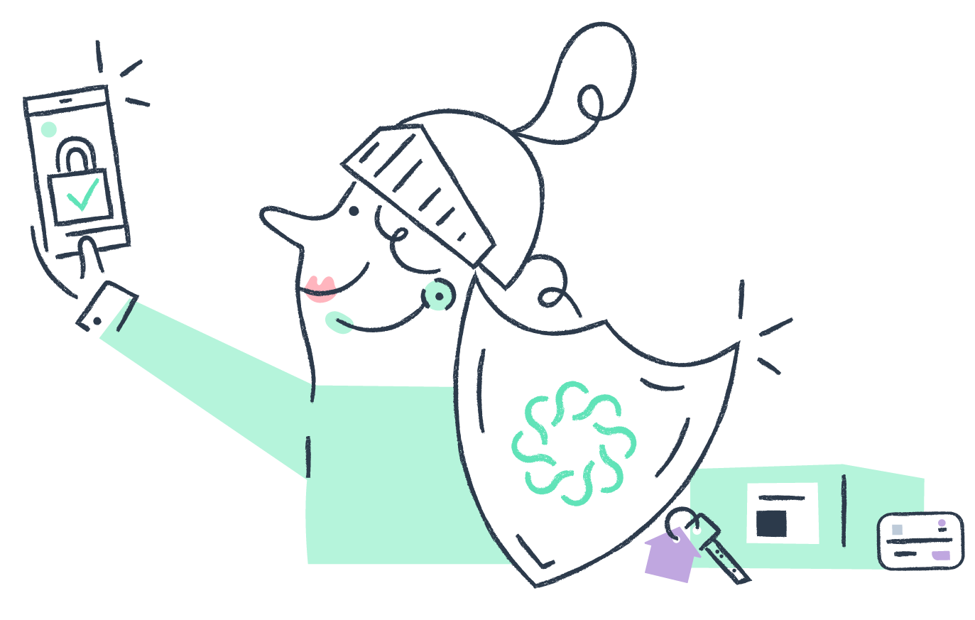
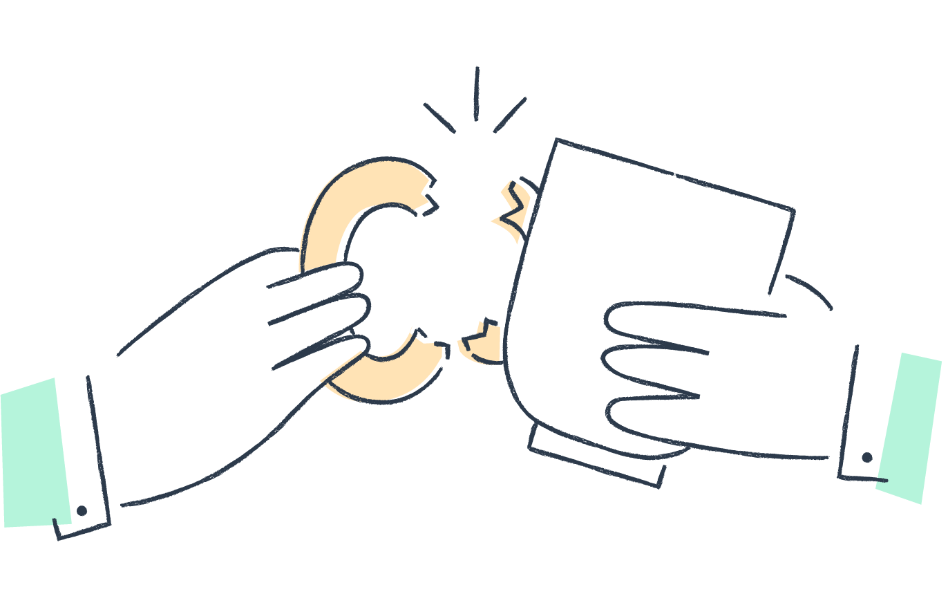
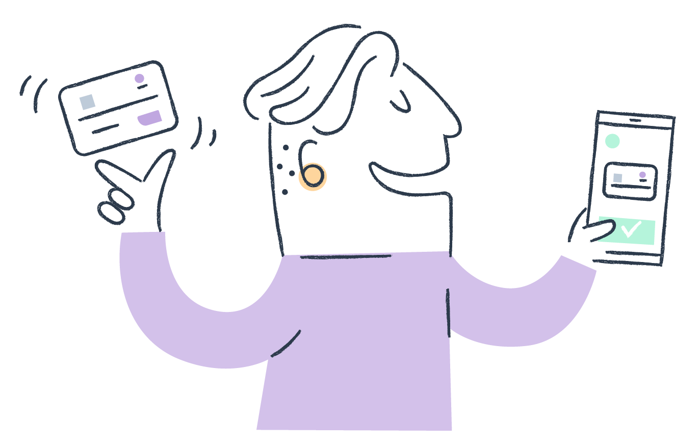
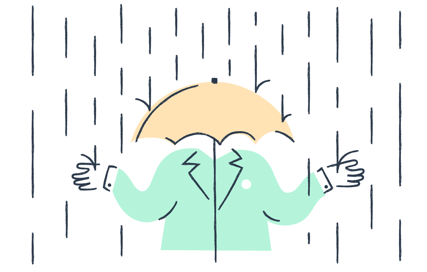
Large
Web Headers / Spots

Toolkit
Devices
Packaging
Map & Pin
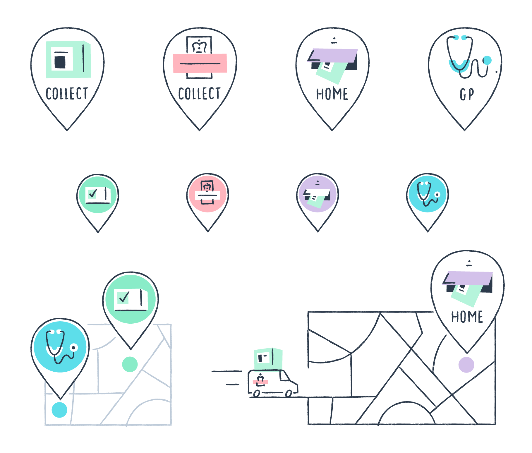
GP Surgery to patient
Lloyds Pharmacy![]()
Wool cool packaging![]()
Patterns - lines![]()
Patterns - shapes![]()
In situ
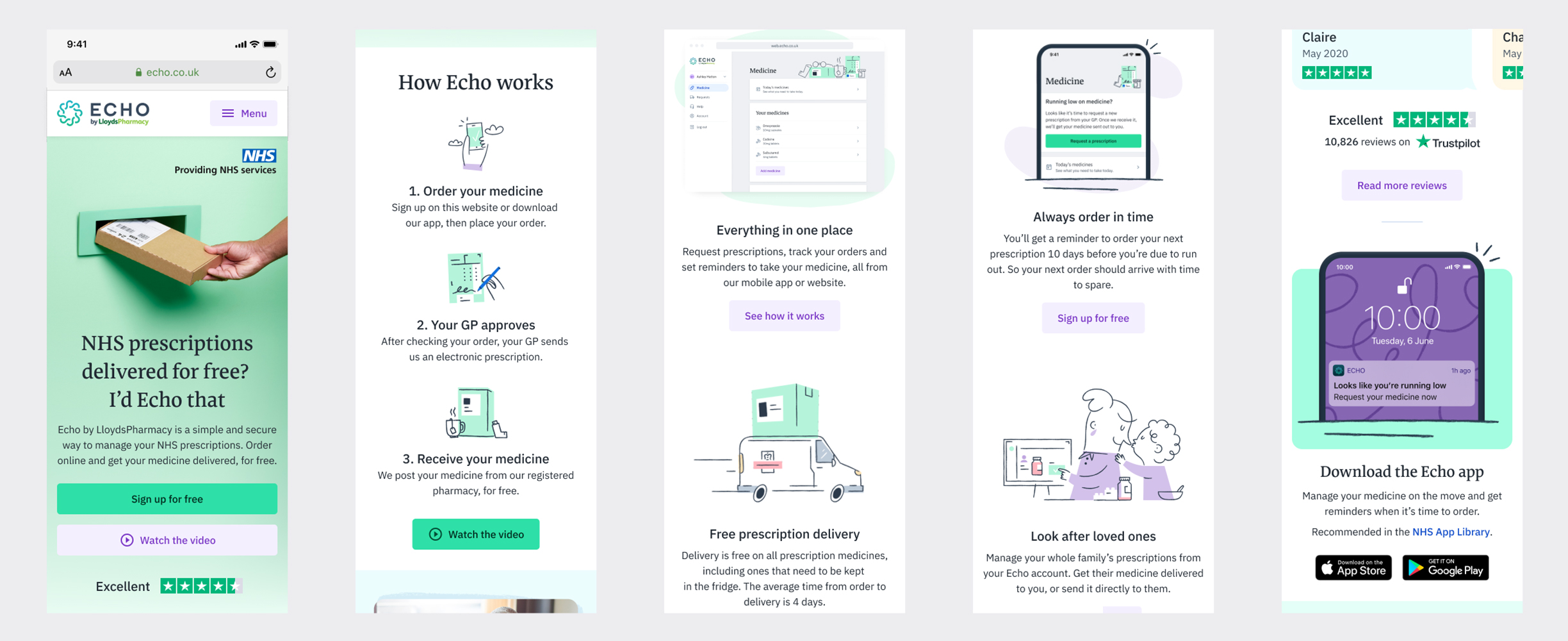
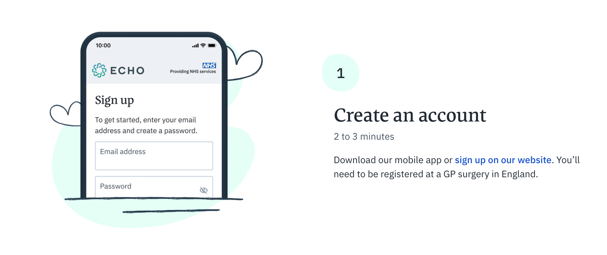
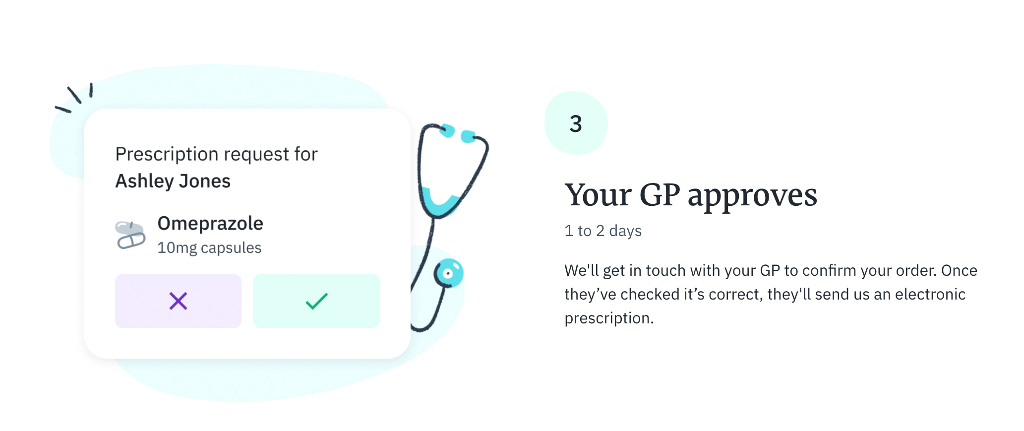
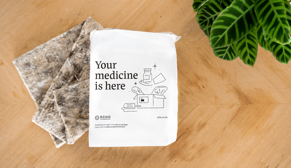
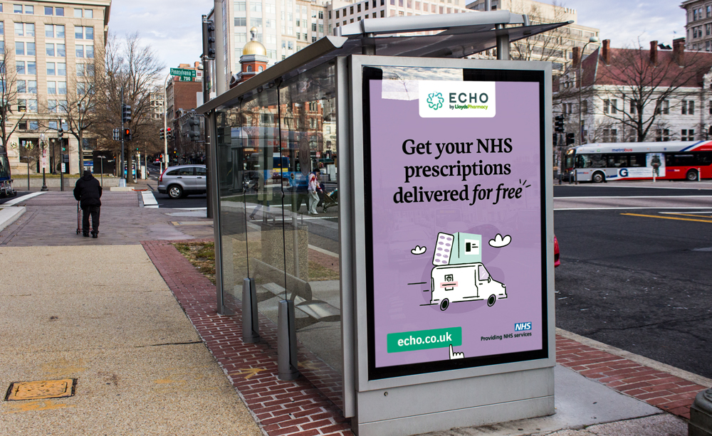


CASE STUDY
Graphic Style
Very graphic and simple, with gestural hand drawn feeling.
The illustrations are based on pencil drawings combined with colored bold and simple shapes. The stroke is fun, quick and human, the bright swatches are alive and give the brand freshness and modernity.

The line defines most of the traits and details while the color shapes help us define the different categories of elements.
1. Echo’s team, boxes and products are always green
2. Echo’s customers are purple
We also have secondary colors for secondary elements.
Characters
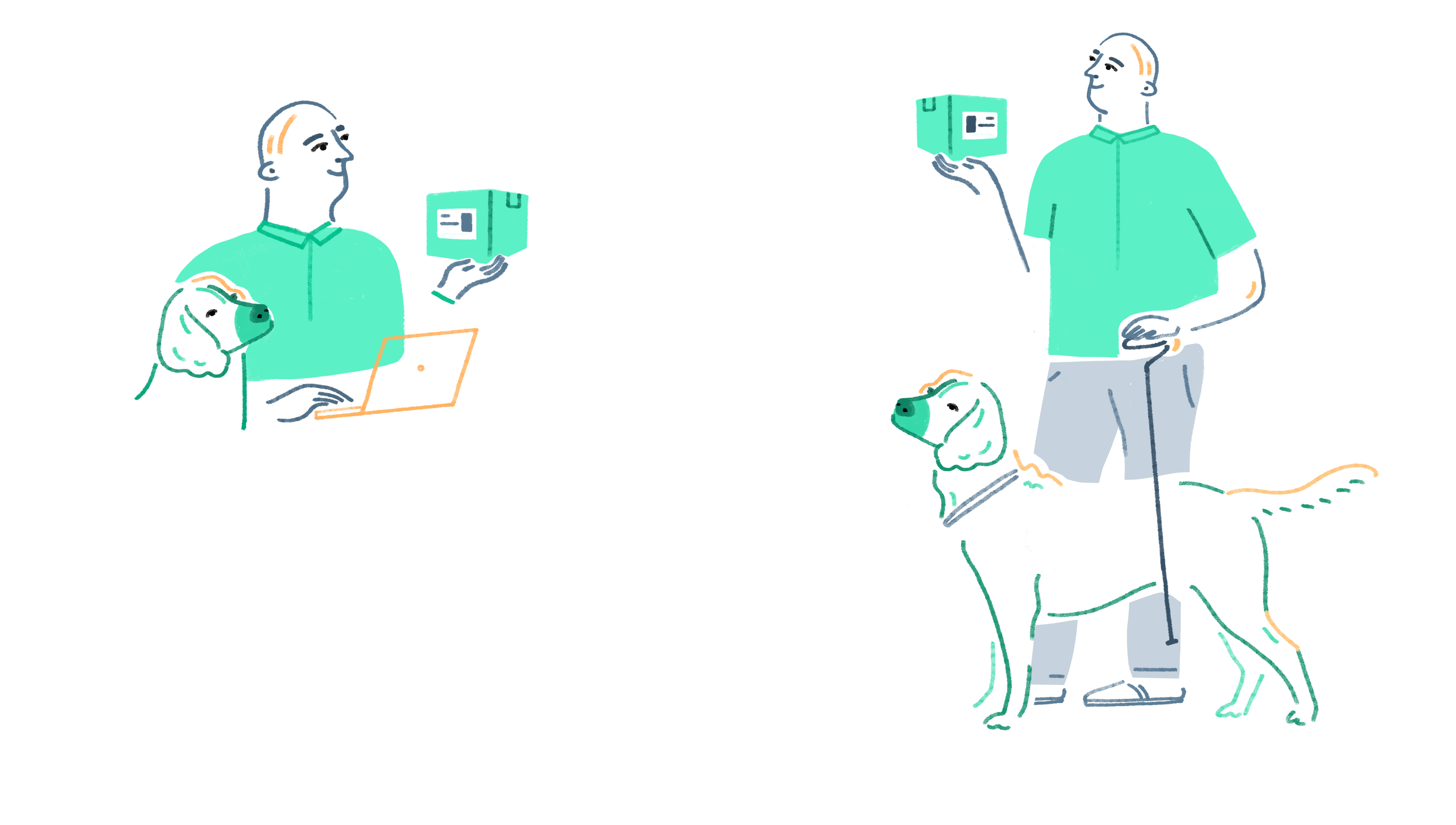
All our characters are based on real people, they are portraits with their own particular traits, single and unique to themselves.
David
Male, 60
![]()
Male, 60
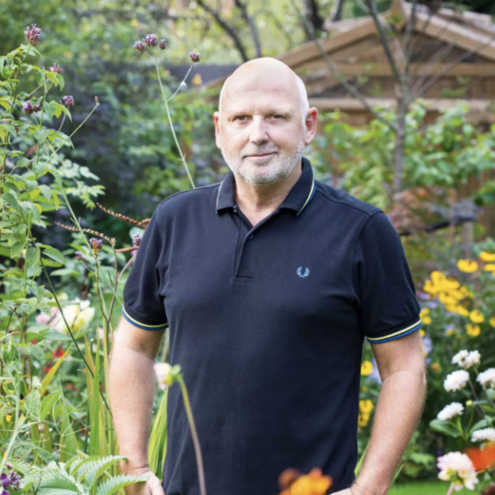
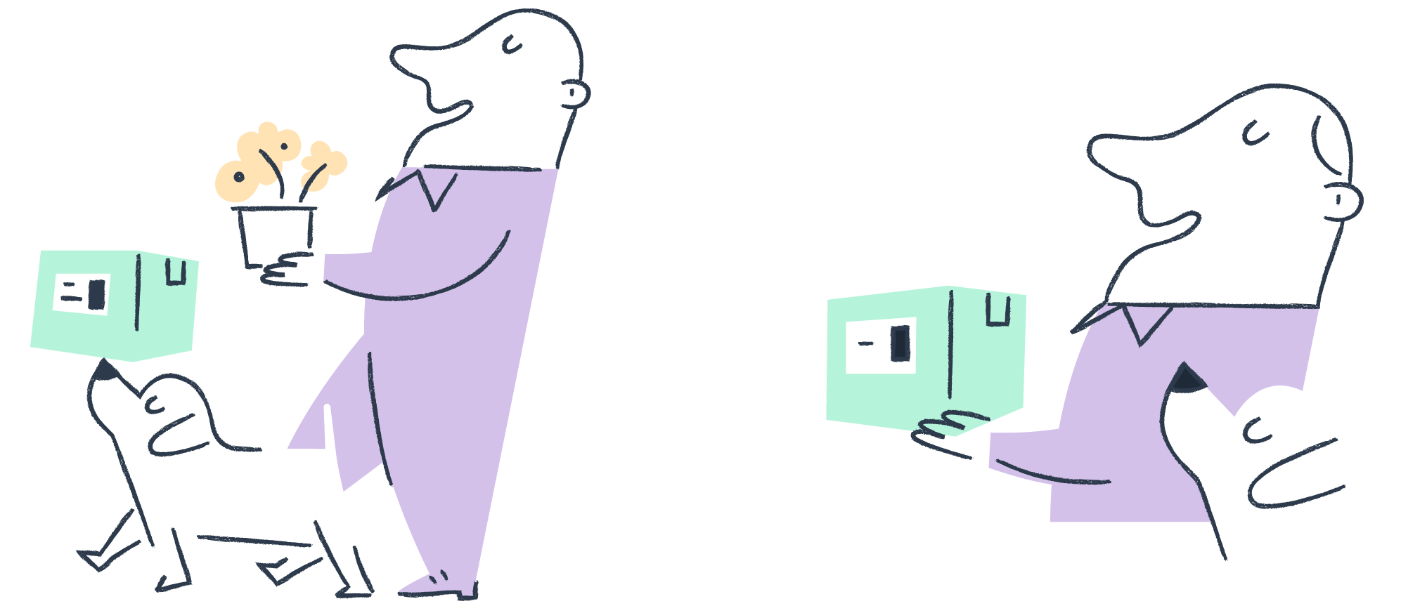
David lives in Windsor and works for a cleaning construction company based in Bracknell, 30 mins drive from his house.
He is a health and safety and environmental manager, spending a lot of work from home or travelling around the UK to different sites. A few years ago he had quite a severe knee operation, so uses a walking stick some of the time for long days. He takes medication to ease his blood pressure.
He spends most of his spare time walking his dog 'Bruce' and looking after his immaculate garden and beautiful house plants.
Jack
Non-binary 24
![]()
Non-binary 24
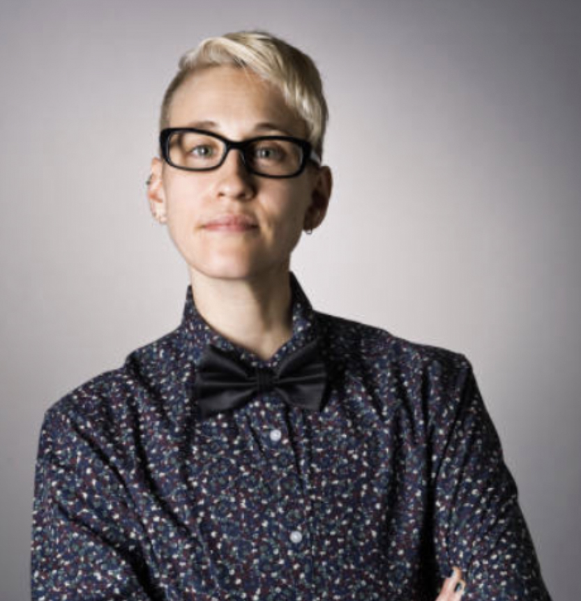

Jack is a food and content journalist and lives on the coast near Brighton. Food and wellbeing are some of the Jacks passionate about, Jack has green fingers and uses space in the garden to grow food and herbs.
Jack loves running and being in nature, as someone who suffers from depression and anxiety. Jack takes Fluoxetine to help combat this illness, because of the busy lifestyle they don't want to spend the time at their local pharmacy that's located 5 miles away especially as they don't have a car.
Jack loves running and being in nature, as someone who suffers from depression and anxiety. Jack takes Fluoxetine to help combat this illness, because of the busy lifestyle they don't want to spend the time at their local pharmacy that's located 5 miles away especially as they don't have a car.
Jumana
Female 30
![]()
Female 30


Jumana studied my pharmacy degree at King's College London. Her journey with Echo started in 2017, and a year later, she became a Senior Pharmacist. Her role involves clinically checking prescriptions, ensuring patients receive the correct medication and training dispensary assistants.
“I feel proud to work for Echo, especially during a time like this as we are able to make pharmacy more accessible for a vast number of people who are self-isolating “
“I feel proud to work for Echo, especially during a time like this as we are able to make pharmacy more accessible for a vast number of people who are self-isolating “
Finding the style
Finding Echo’s style through market researh, strategy and style exploration
First step for my is always understand the company and the landscape where it lives. The goal is to find what makes their product distinctive and to be true to their core values.
Looking at pharma, technology-driven healthcare, medical services and the wellness industry in the UK we realized that the best approach was to take from the regional identity and enhance it with a bright color palette outside the very common green and blue of pharma. We also knew we would be using characters to tell personal stories of real people.
Looking at pharma, technology-driven healthcare, medical services and the wellness industry in the UK we realized that the best approach was to take from the regional identity and enhance it with a bright color palette outside the very common green and blue of pharma. We also knew we would be using characters to tell personal stories of real people.
Exploration
Direction 1: British tradition in cartoons and advertising
Direction 2: British tradition through vintage pottery
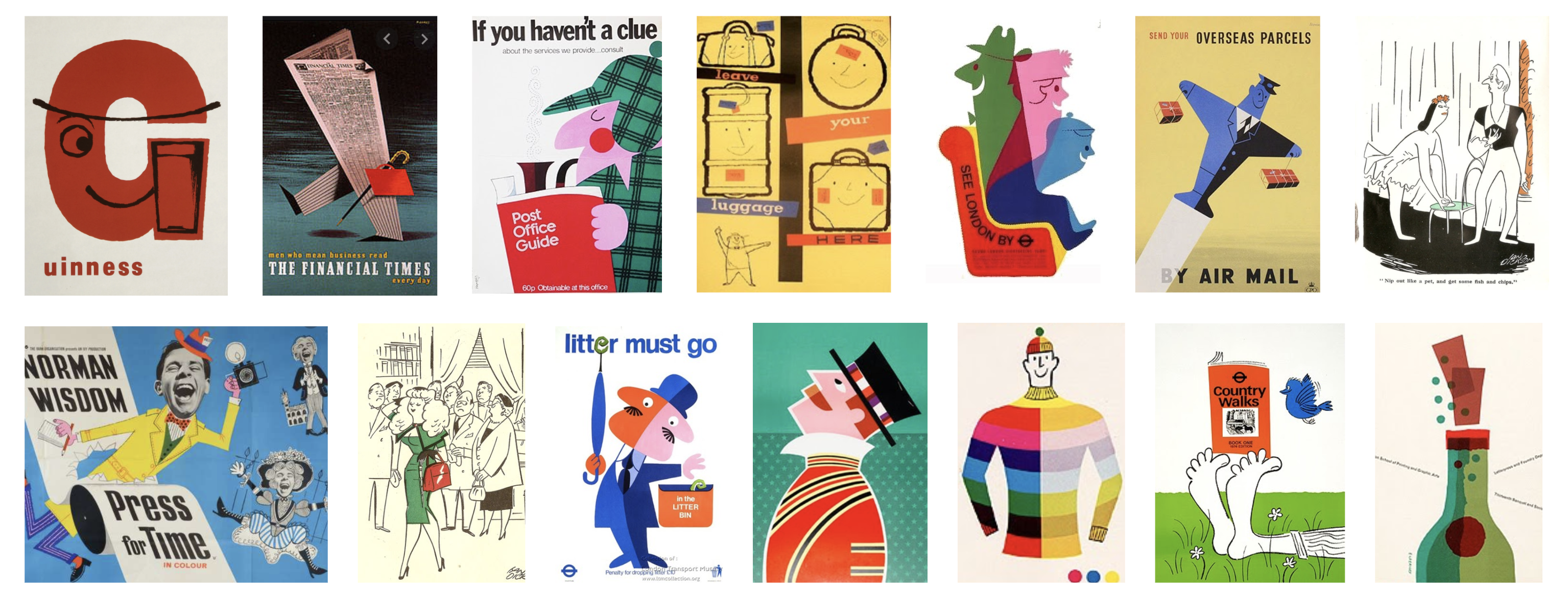
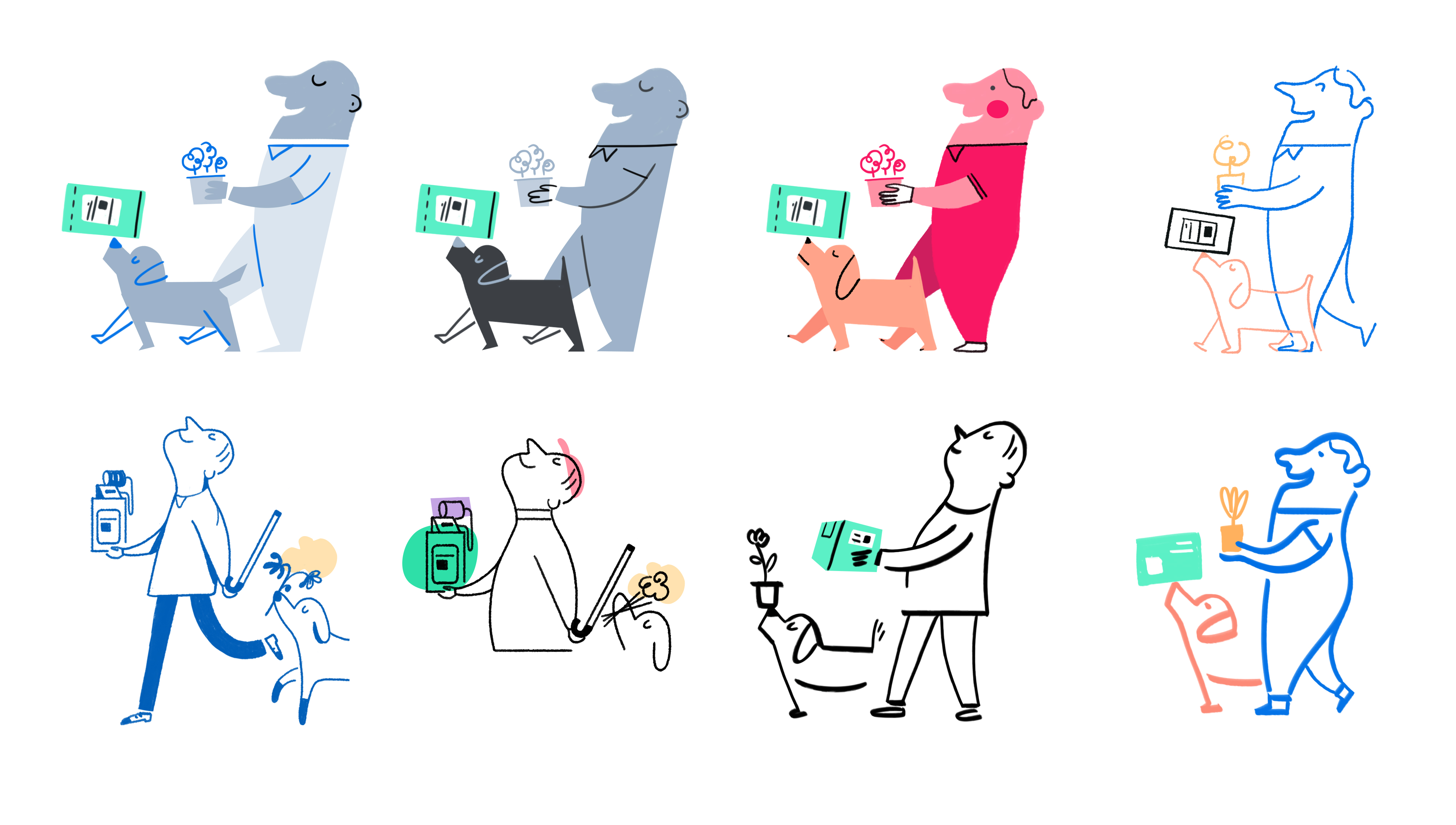
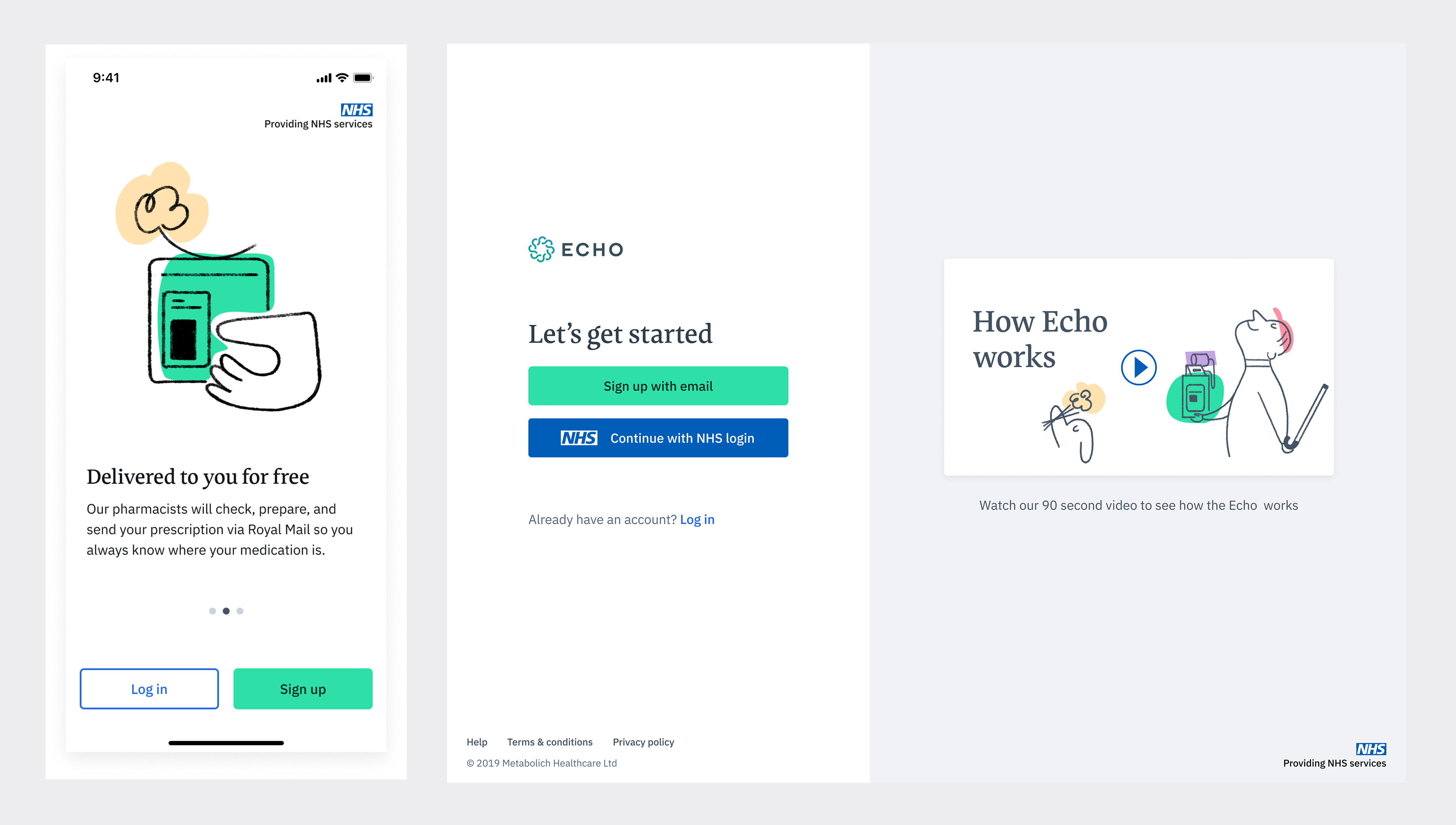
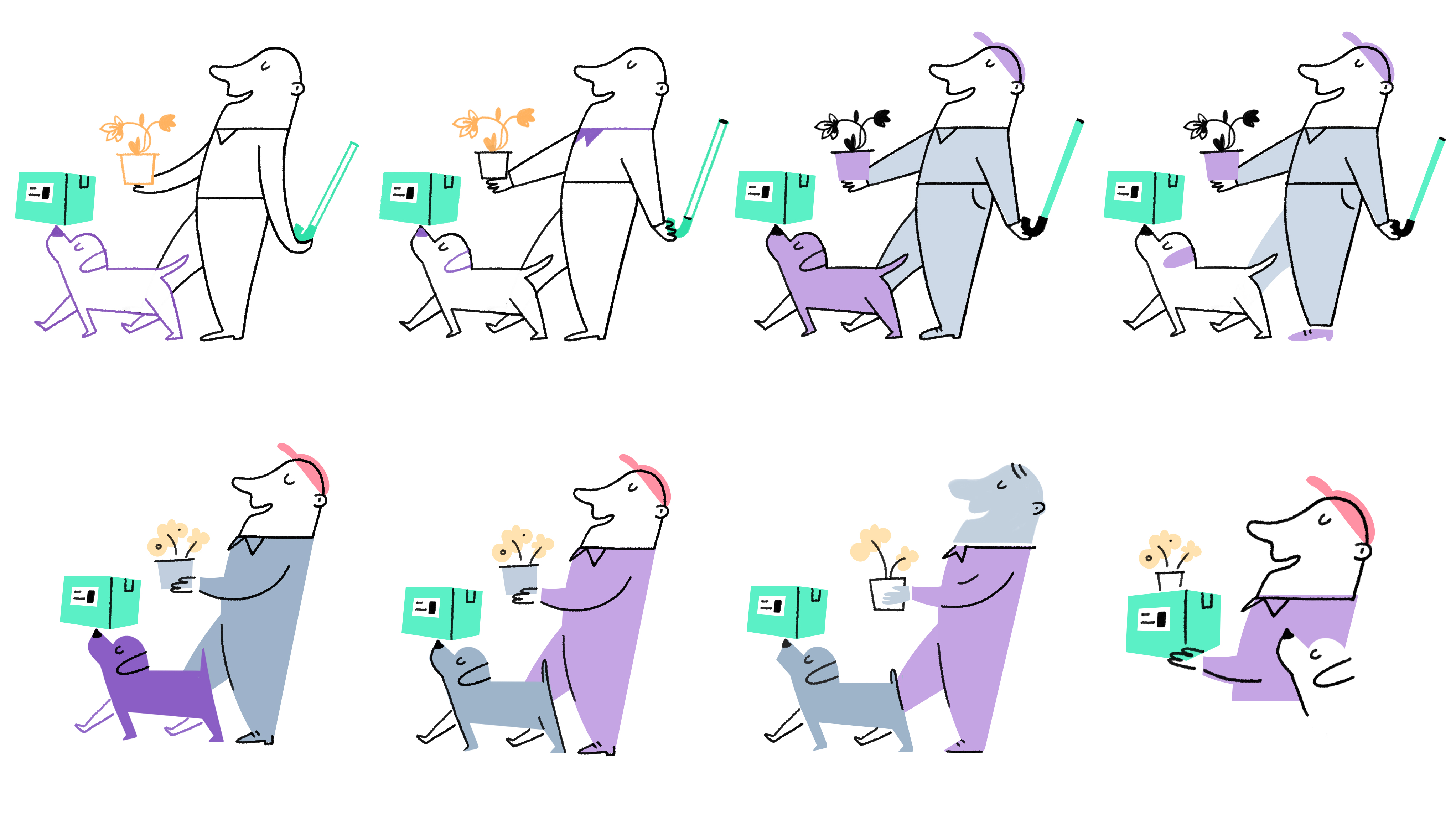
Market testing, direction 1 is choosen.
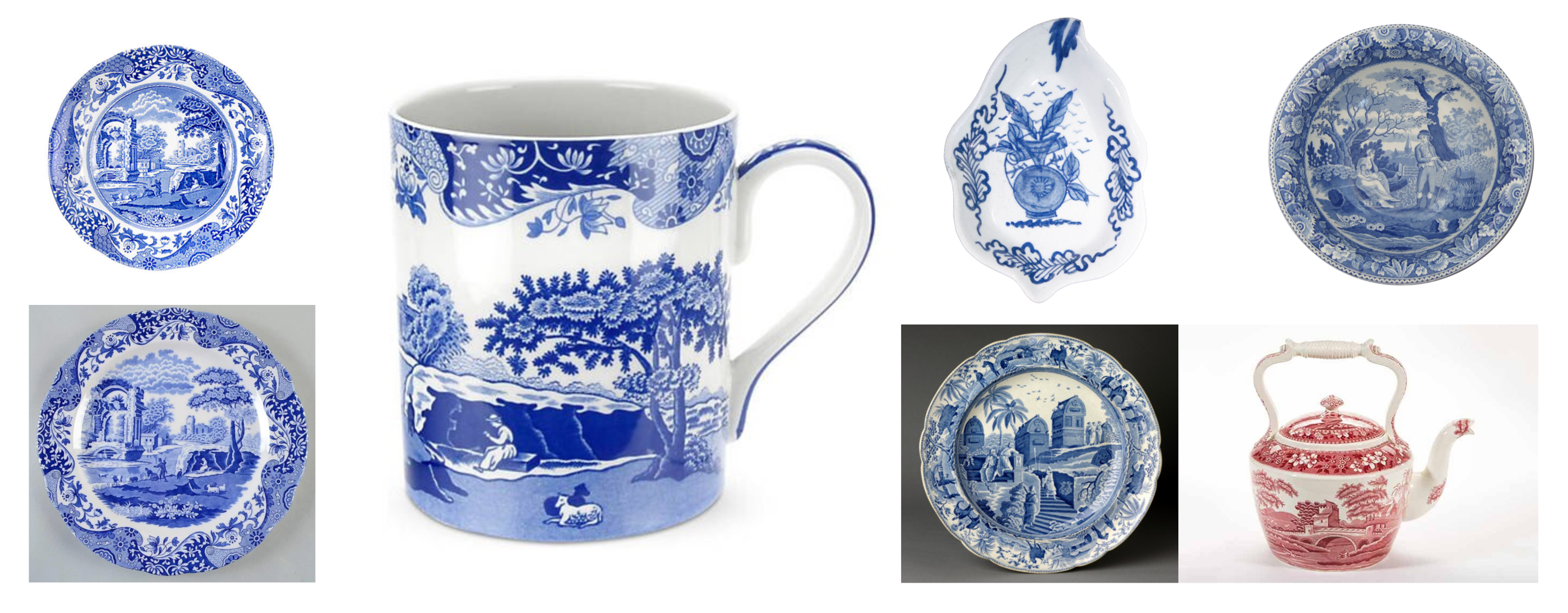


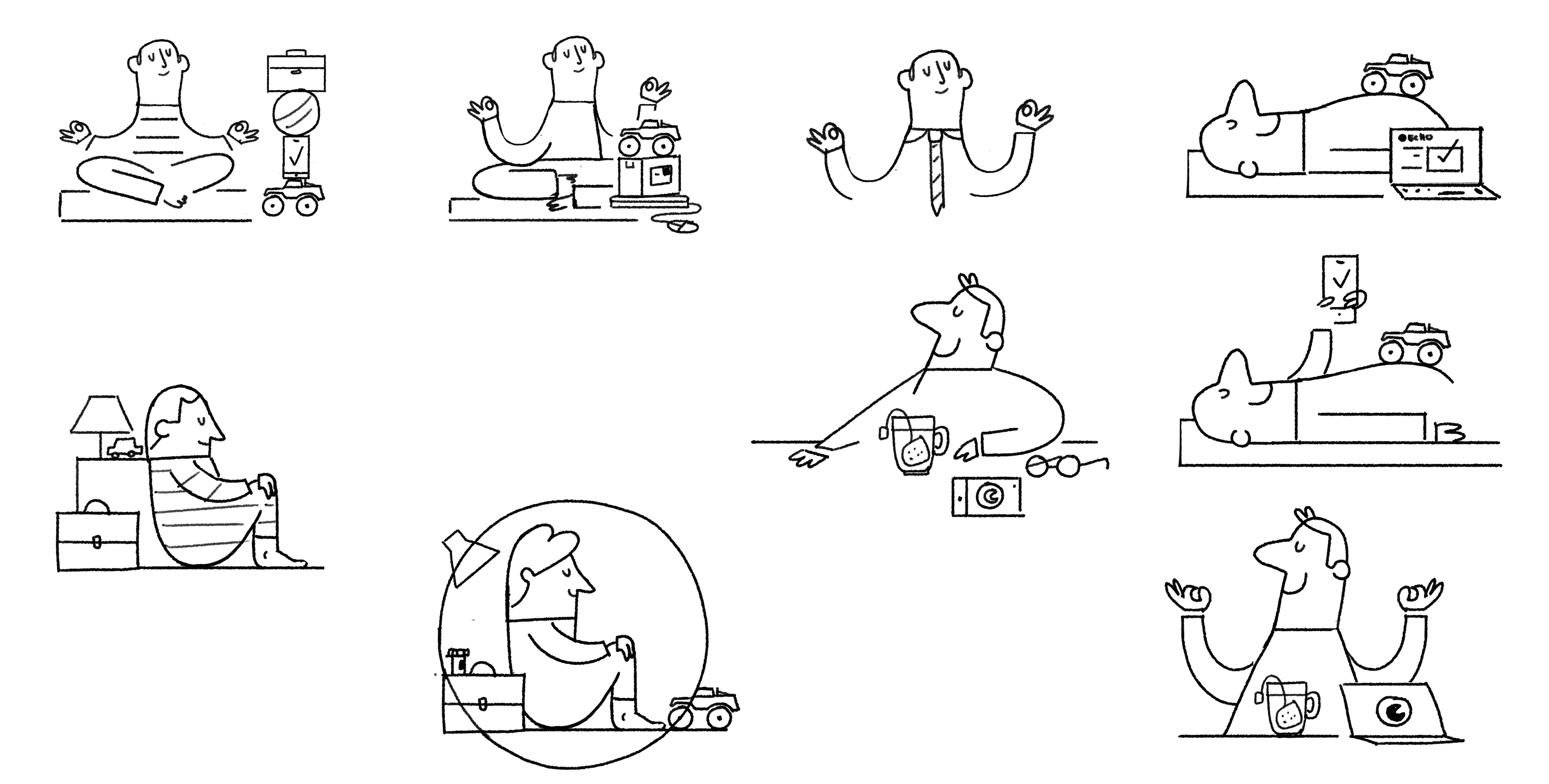
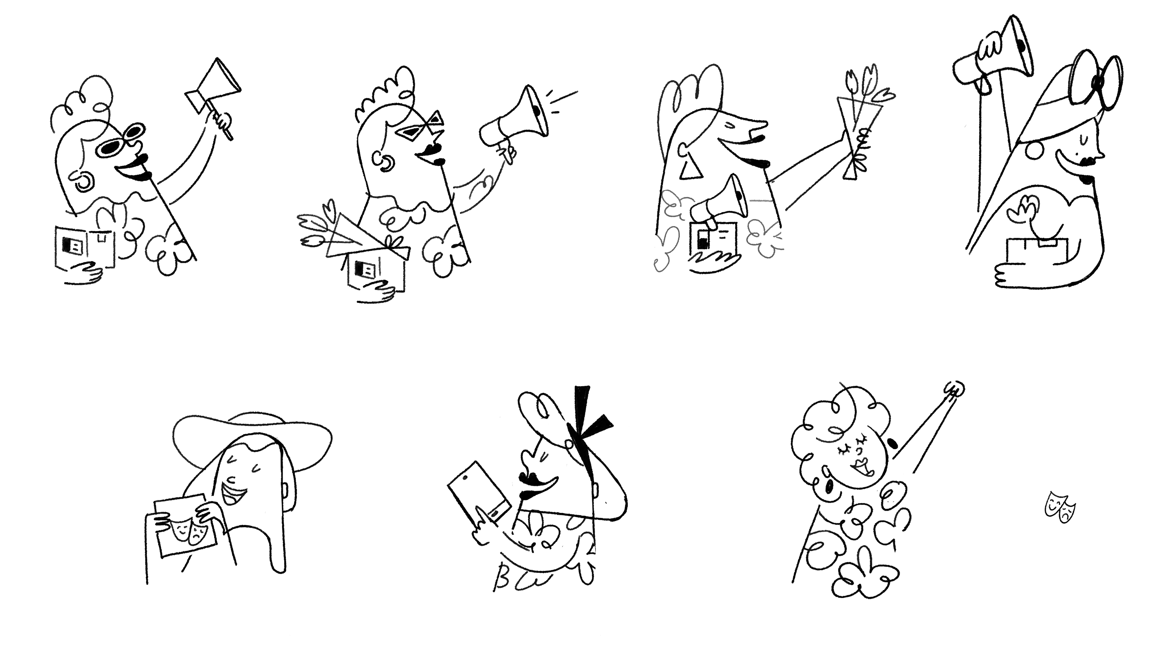
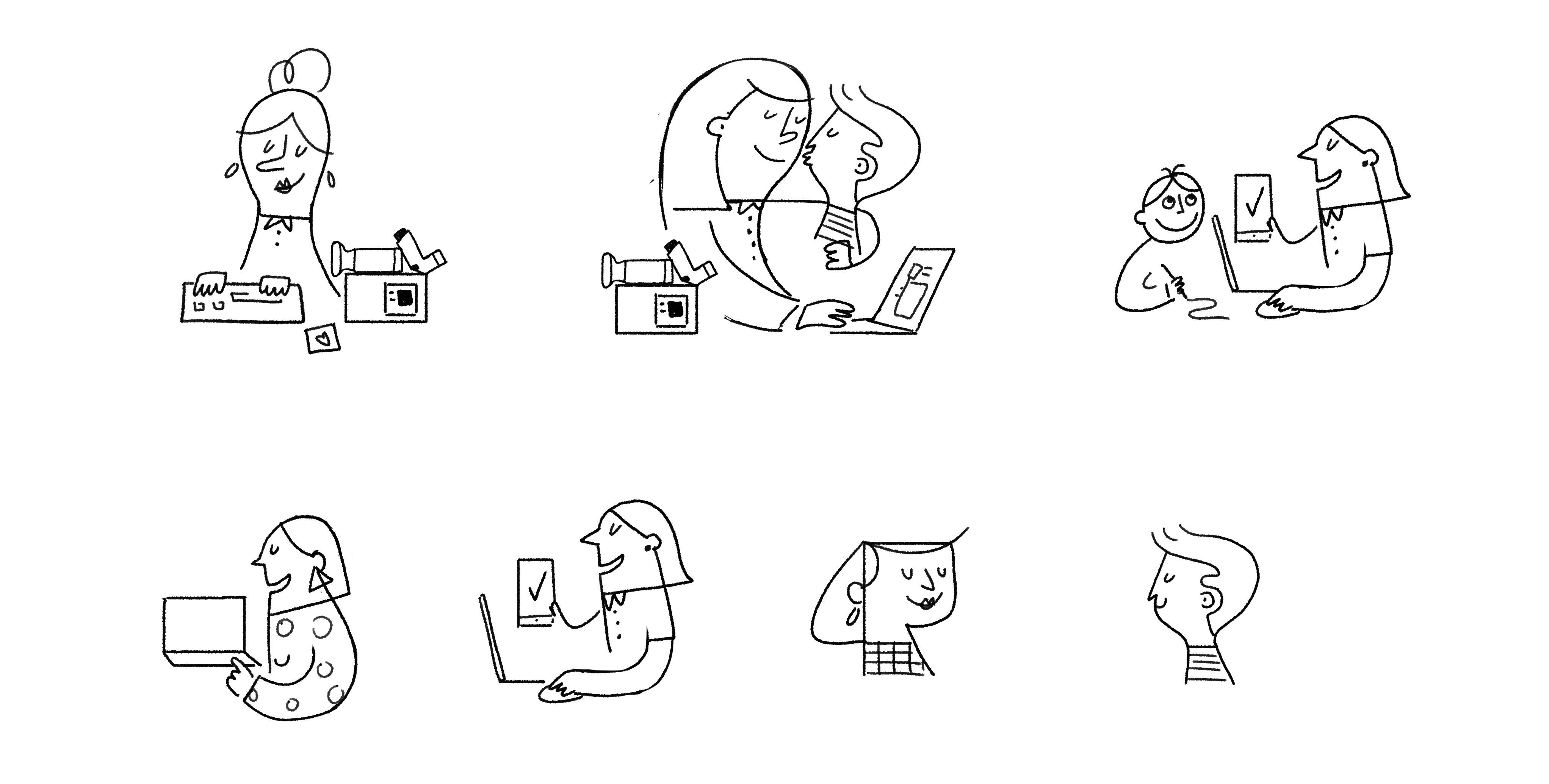
Style development
Character sheets

Color

Spots - Sketches



Credits
Brand design team at ECHO.
CD: Andy Ainger - AD: Zac Davidson - Designer and animator: Liam Owen
All images © lauraalejo.com 2005-2023
Powered by PROMSITE BY CDMON
Powered by PROMSITE BY CDMON


